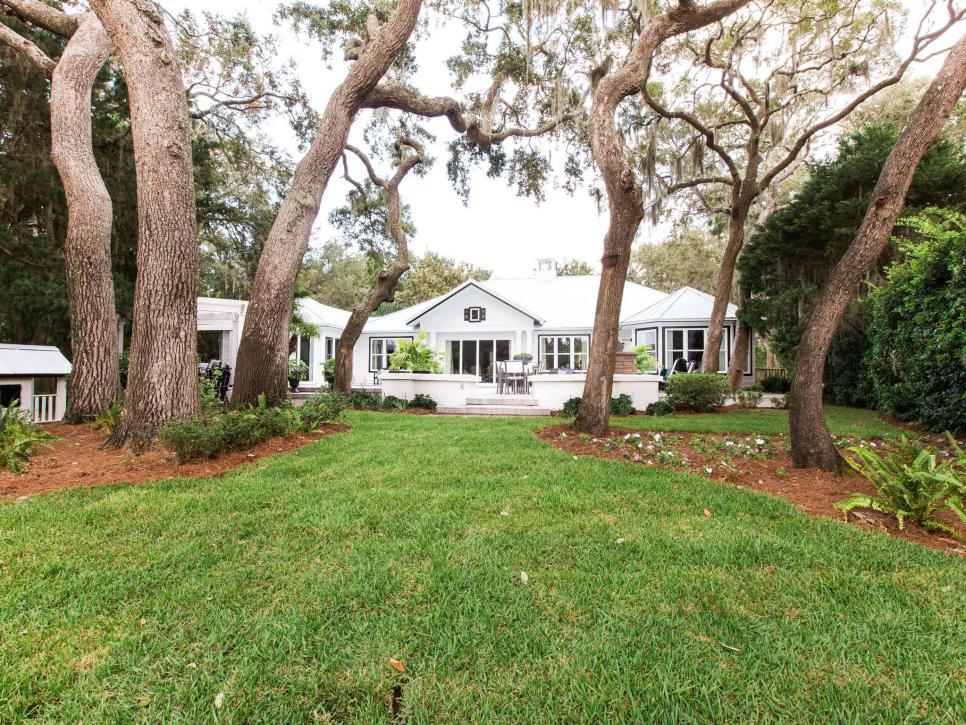
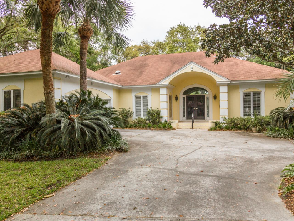
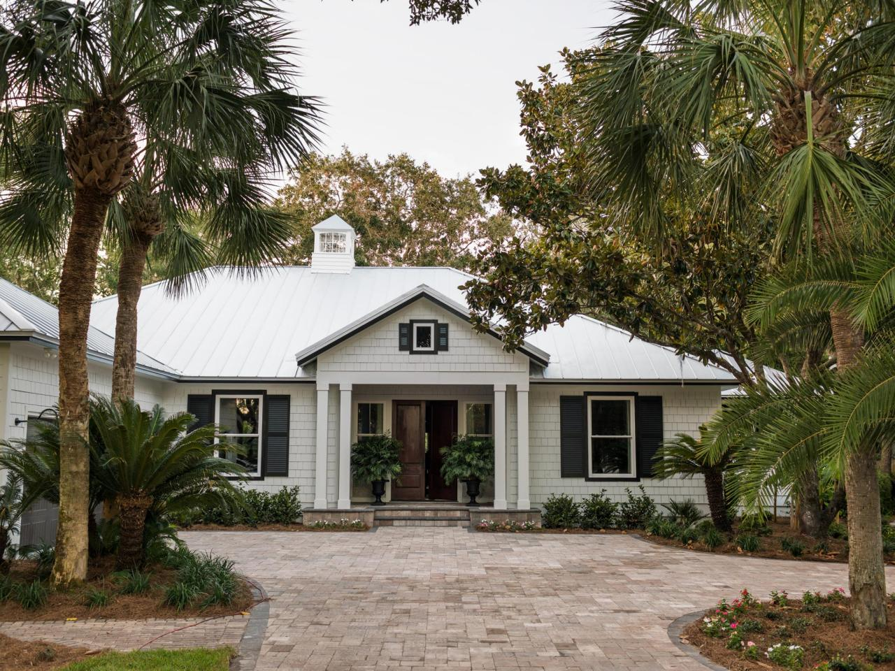
One thing I look forward to every New Year’s Day is the unveiling of the HGTV Dream Home. I like to watch to get attainable (they use materials from every-man retailers like Lumber Liquidators, Wayfair and Cabinets to Go) design ideas to implement in my home or to inspire new designs for clients. I really like that over the past few years HGTV remodeled existing homes vice building anew as they always used to. This year’s home was a stunning remodel converting a Contemporary-Spanish-ish home on St. Simons Island, GA into a Modern-Low Country beauty.
They did away with a previous yellow stucco in favor of a white cedar shake siding and bold black trim and shutters. The entry way and several other access points were converted from dated archways to expansive double doors. Finally, the brown architectural shingle roof was changed to a lovely metal roof complete with an adorable cupola to give it an authentic Low Country look. The conversion looks great, and close up shots reveal gorgeously finished wood front doors, but from a distance I’d maybe like to see a front door with a fun color maybe a vibrant mango or coral, especially since this is a seaside community.
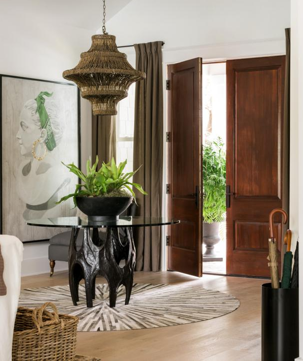
The interior designer, Brian Patrick Flynn, wasn’t afraid to take a few risks in the interior and achieved bold looks without looking totally whacko. This large scale bust portrait at first glance has an air of traditional to it, when in reality, with her bandana and earrings, she’s a bit irreverent and lets you know her owner has a sense of humor.
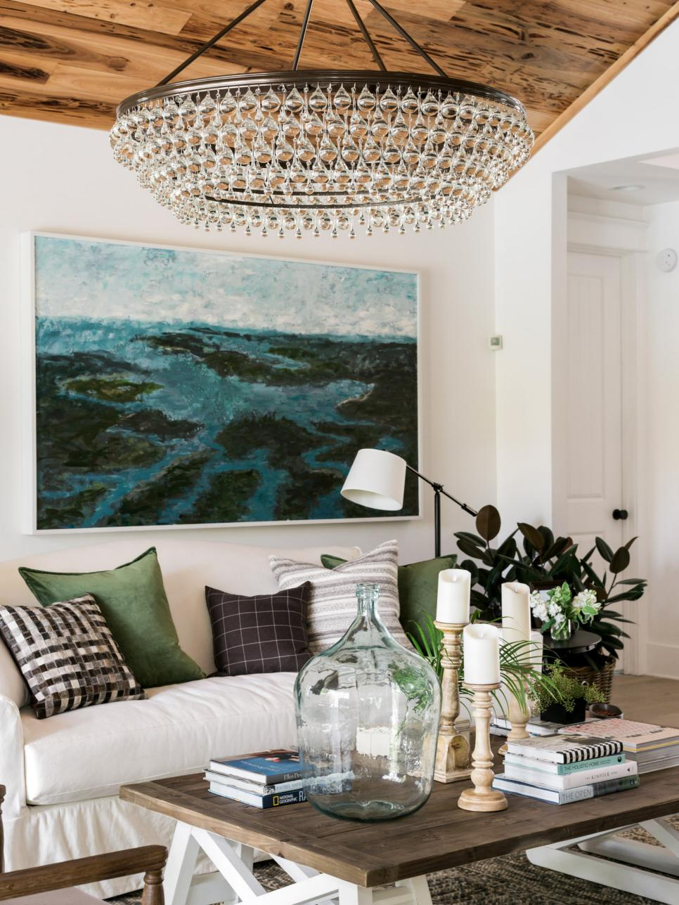
This living room is a great mix of styles, Southern, Rustic, Glam, Cottage…. which could easily have gone awry, but instead looks relaxed and collected.
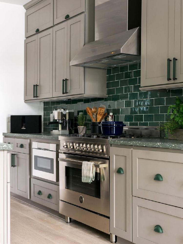
Ok, I’m a bit conflicted on the kitchen selections. I really like the drab khaki-grey toned shaker cabinets as they remind me of the early 2000’s Martha Stewart drabware everything. Totally a great fit for a Low-country home and a great alternative to the bright white cabinet of 2016. But oh, the green subway tile AND green counters AND green hardware? I get the earthy vibe it’s trying to elicit to keep in touch with the swampy, Spanish moss covered setting…. but it’s a bit much for me.
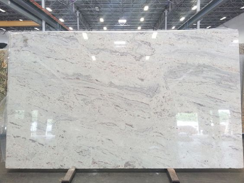
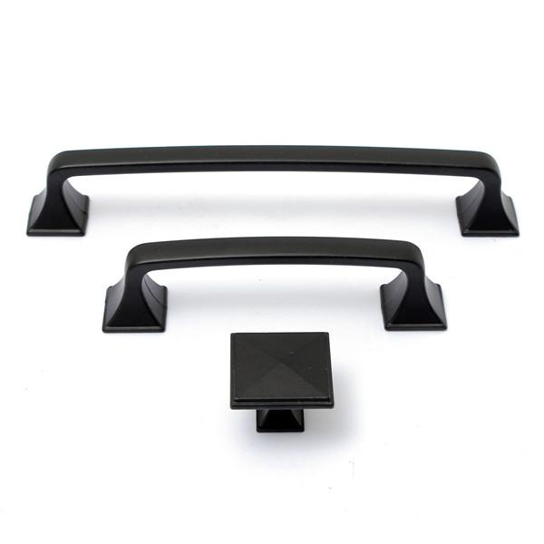
I’d change out the counters for something like this and the hardware for something in black, like this one below.
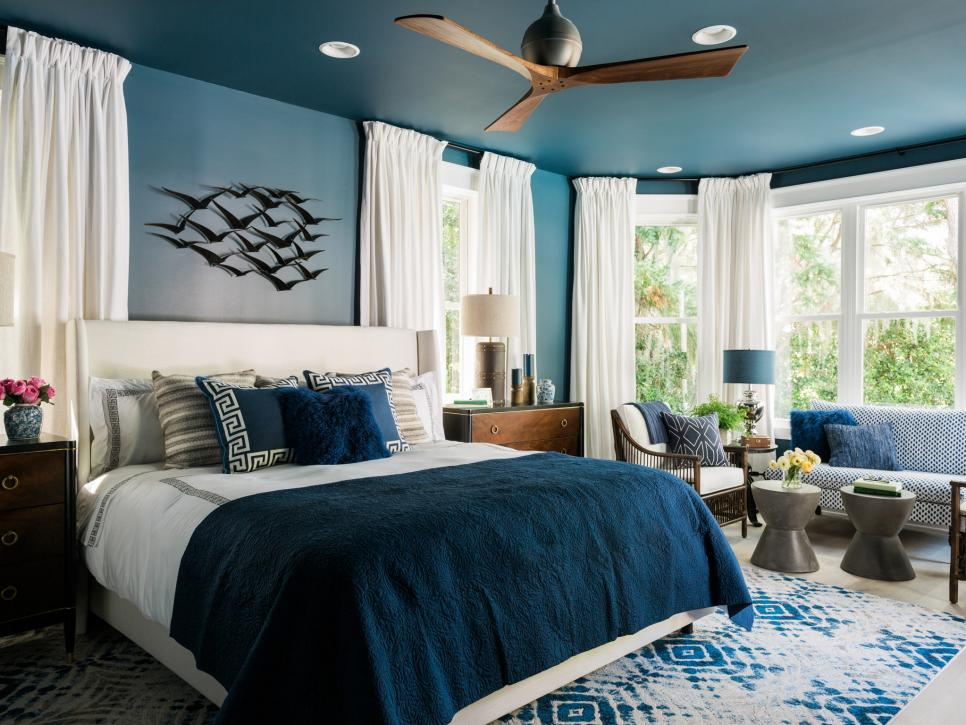
This Master Suite design is spot on. The blue shade is calming but rich and vibrant and I think taking it onto the ceiling was the right decision (maybe without the bright white can lights, though). I think we’ll see a resurgence of the traditional heavy drape in 2017 too, and Brian Patrick Flynn does them perfectly here, keeping the color light and style classic.
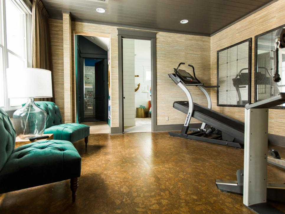
Usually home gyms are utilitarian and stark. Why not exercise in a space that has a bit of style so that even if you don’t enjoy what you’re doing you can at least enjoy where you are? Cork floors are a smart choice for the occasional dropped weight and are forgiving on the joints, not to mention looking classy. The mullioned antiqued mirrors are also a great choice that make this look more like a real thoughtful room in the home than just an industrial utilitarian space.
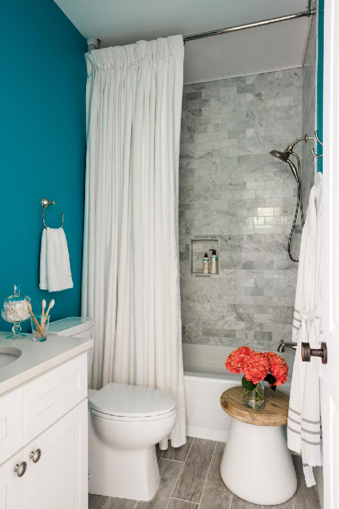
I wanted to be sure to share this guest bathroom from the HGTV Dream Home. Is it the most spectacular bath in the home? Nope, not at all, BUT I think the setup of this bathroom is very similar to bathrooms in many American homes – it’s small, has room for just a single vanity, and has a standard tub – yet it still looks fantastic. Some takeaways for what you could copy, rather than a regular shower curtain, use real drapes and take them from ceiling to floor. Remove that frameless contractor grade mirror and replace it with a uniquely framed mirror and don’t be afraid of a bold color, especially if your fixtures (sink, tub, tile etc.) is white. You could do those 3 things for under $200 and totally give a new 2017 look to your bathroom.
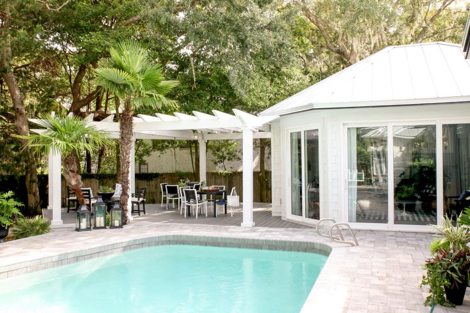
Finally, one of my favorite spaces in this home is actually not in the home at all, it’s the backyard and pool area. Much of the style isn’t because of any intentional styling at all but rather due to the landscape designers decision to leave lots of foliage, including that lovely dripping Spanish Moss.
