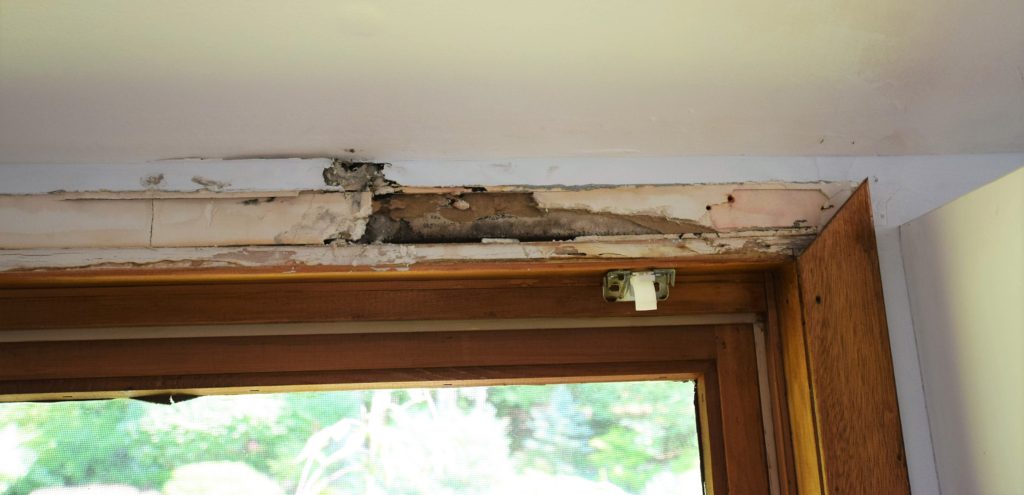
Well, we did it. This is either the stupidest thing we’ve ever done or the most brilliant. I’m talking about our decision to buy a new house. A house that, for us, was pretty expensive, and yet still required work. After 5 days post move in I was convinced that it was a dumb idea. We had already found 3 leaks and evidence of a mouse infestation. I was probably just tired and overwhelmed from all the hassle and chaos of moving and I wasn’t seeing the big picture. The bigger picture is that this house is huge, about 5200 square feet. It has all the things we wanted, a pool, a 3-car garage, was in our kids current school boundary, and most importantly, it had space. Wonderful, glorious space. I could stretch my arms out wide at our last house and touch both my and my neighbor’s home, so this new house on 5 acres, just outside of Washington DC, is a rarity and a real treat. Sure, everything has its cost, and in this case getting what we wanted was going to cost us both monetarily and with the promise of investing time and sweat equity. So now, after being in the house for just over a week, and already starting a few small projects, and in the midst of unpacking I’m feeling better about our decision. Welcome to my major project, my new home!
My hope is to be able to document the renovation on the blog from start to finish. So first, I guess it’d be smart to show you some “before” pics and describe the place. Warning, these pics (namely the interior) show unadulterated moving mess and chaos.
Real estate is all about location, location, location, right? This house is in Fairfax County, VA. Close enough to commute to downtown DC for work every day, some of the best schools in the country, and quintessential suburbia. Except this house is nestled in the woods on one of the few remaining 5+ acre lots in the county. The location is about as close to perfection as we could get.
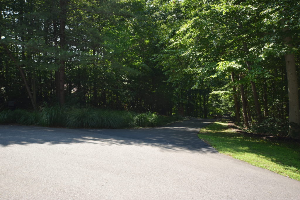
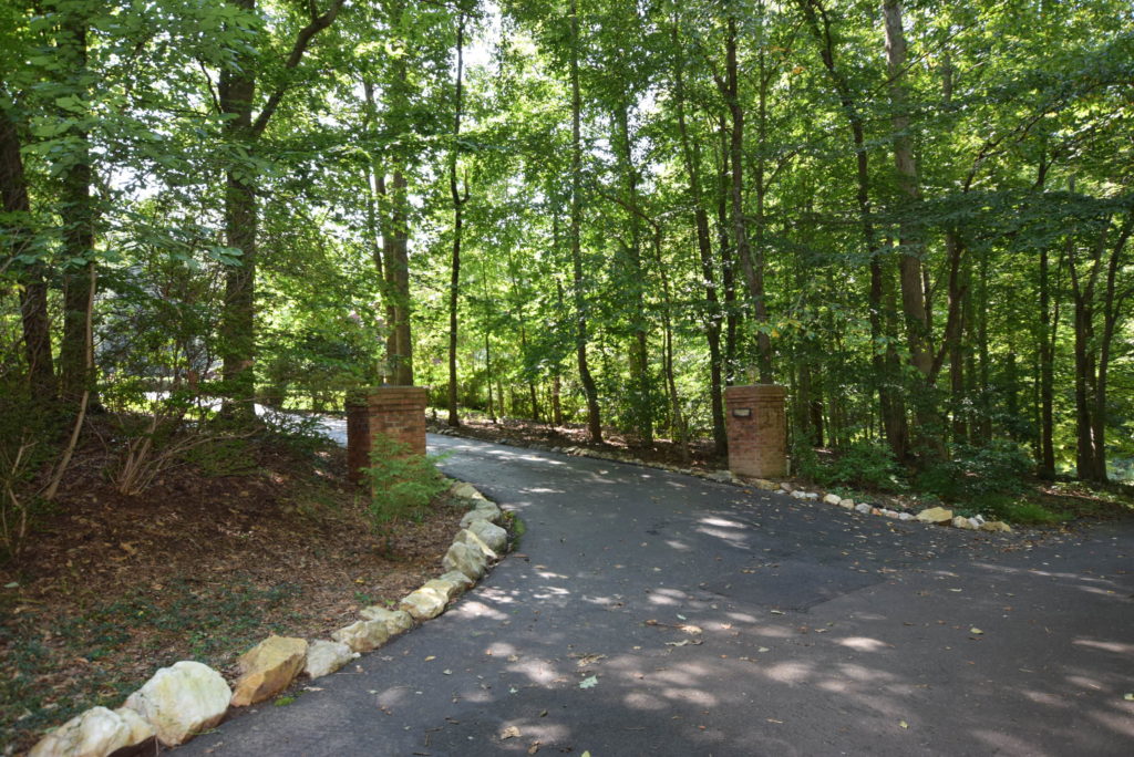
The lot is at the end of a cul de sac on a private drive. It’s so nestled in the woods that you can’t even see the house from the street.
The house style is a 1980’s contemporary. It’s got a long and rambling floorplan that contains one main living level and a walkout basement level. The current style, both inside and out could most politely be described as “retro”. I’m pretty excited to venture into designing a contemporary home since almost every project in this area is traditional, colonial, or coastal. This will be a great change of pace and a bit of a challenge for me design wise, but I’m up for it!
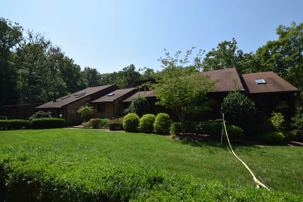
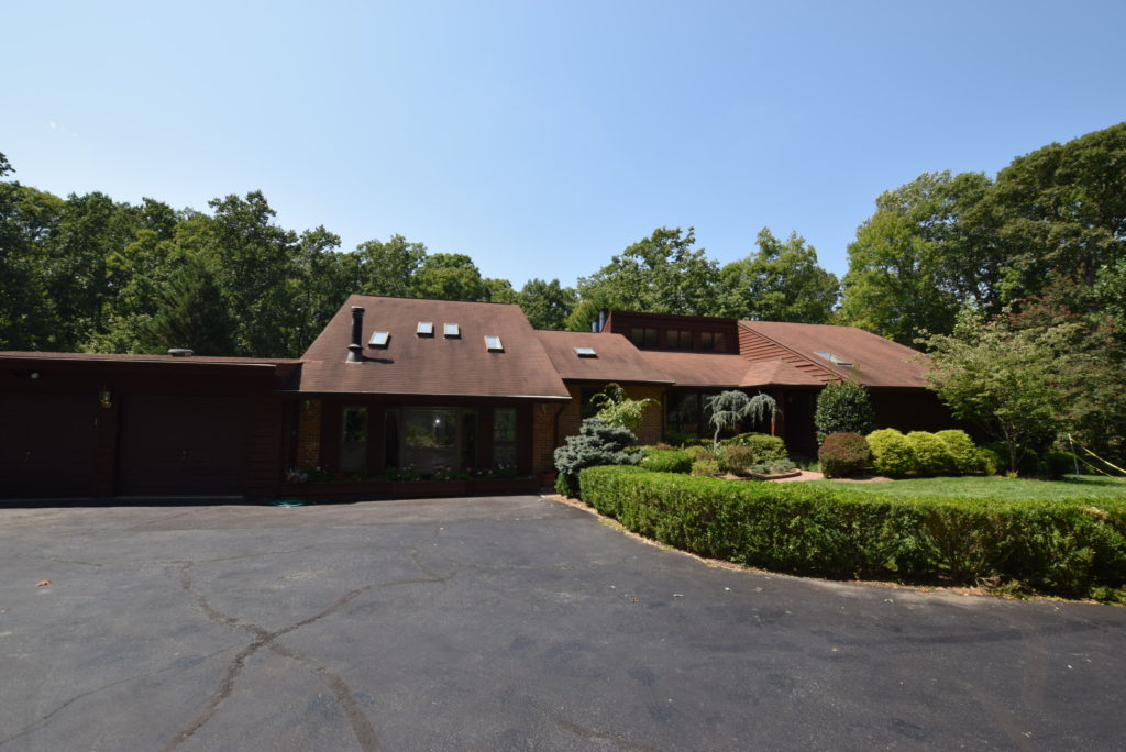
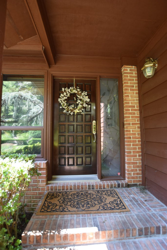
The exterior of the home is brown, lots. of. brown. Brown wood siding, brown brick, brown painted wood decks, brown asphalt shingles. The solid wood front door blends right in because, yep, you guessed it, it’s brown,
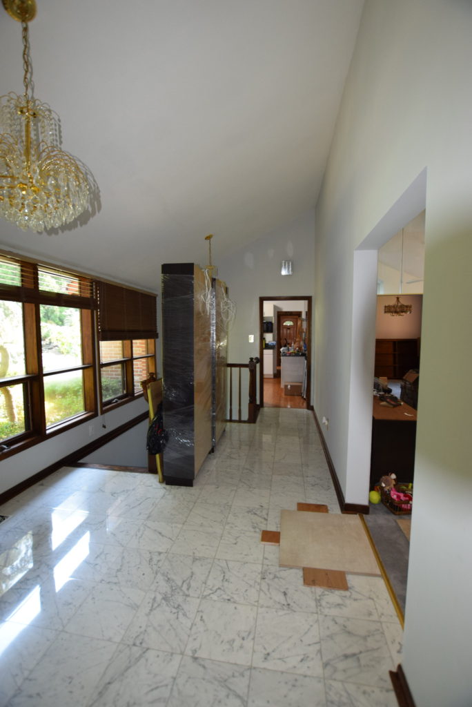
The foyer is large, has lots of good light from the front windows, some crystal and gold chandeliers that aren’t my bag and frankly don’t go with the home. The flooring is a glossy Carrera marble tile, which isn’t bad, but several tiles are cracked. The foyer is the central hub with stairs leading to the basement (and a very traditional style railing), forward to the living room, left to the kitchen and right to the two main floor bedrooms. Yep, new flooring samples are scattered on the floor presently.
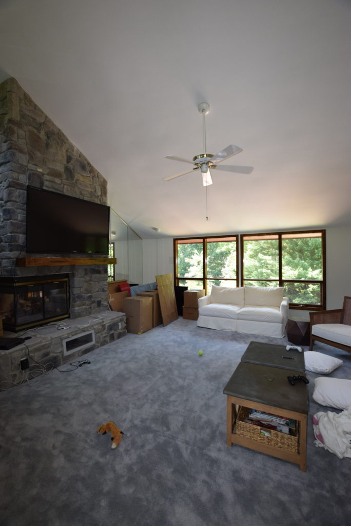
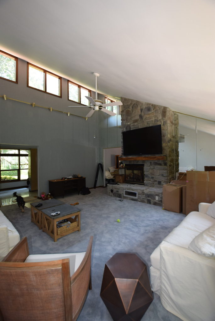
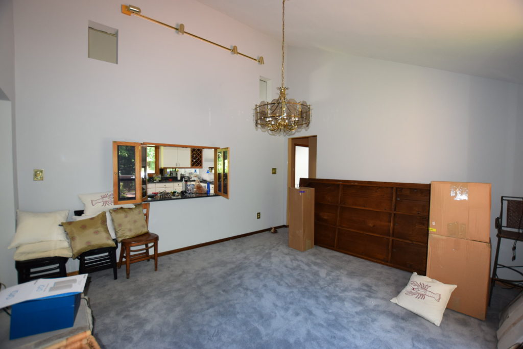
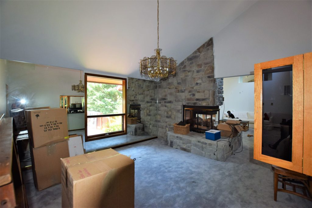
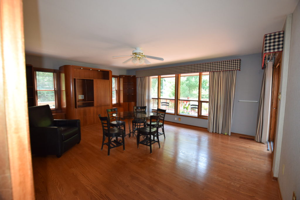
The living room is huge. Everything in it looks huge. Big wood picture windows with casement bottoms, vaulted ceiling to probably about 20 feet high, massive stone fireplace and the first appearance of the omnipresent mirrors. I haven’t counted, but this house is like a funhouse. There are mirrors everywhere you turn. Full wall mirrors, cutout mirrors, tiled mirrors, mirrors on top of mirrors. The living room also boasts the spongiest carpet I have ever felt. My daughter has taken to practicing cartwheels here because it’s just like a gymnastic floor.
The dining room is connected to the living room and shares the fireplace wall. There is a smaller window overlooking the back yard, flanked by, yes, more mirrors, and a fun little drive through opening to the kitchen. And by fun, I mean for my 10 year old self when I used to dream of working the drive through at McDonald’s (talk about #goals). The dining room also has a chandelier very typical for the 1980’s, bright brass and faceted glass panels.
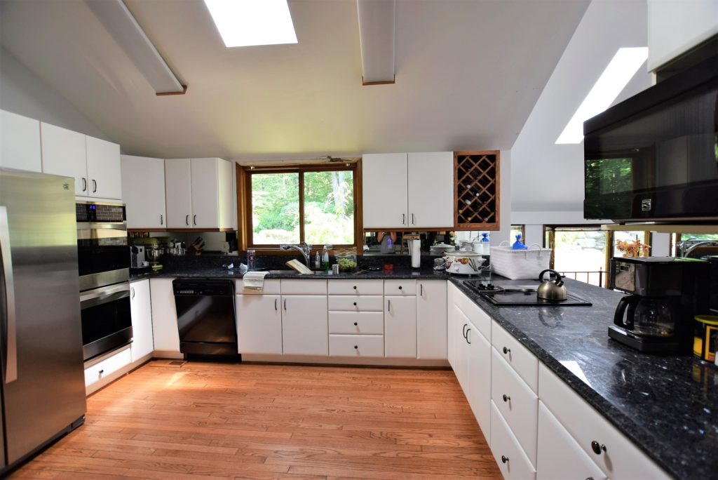
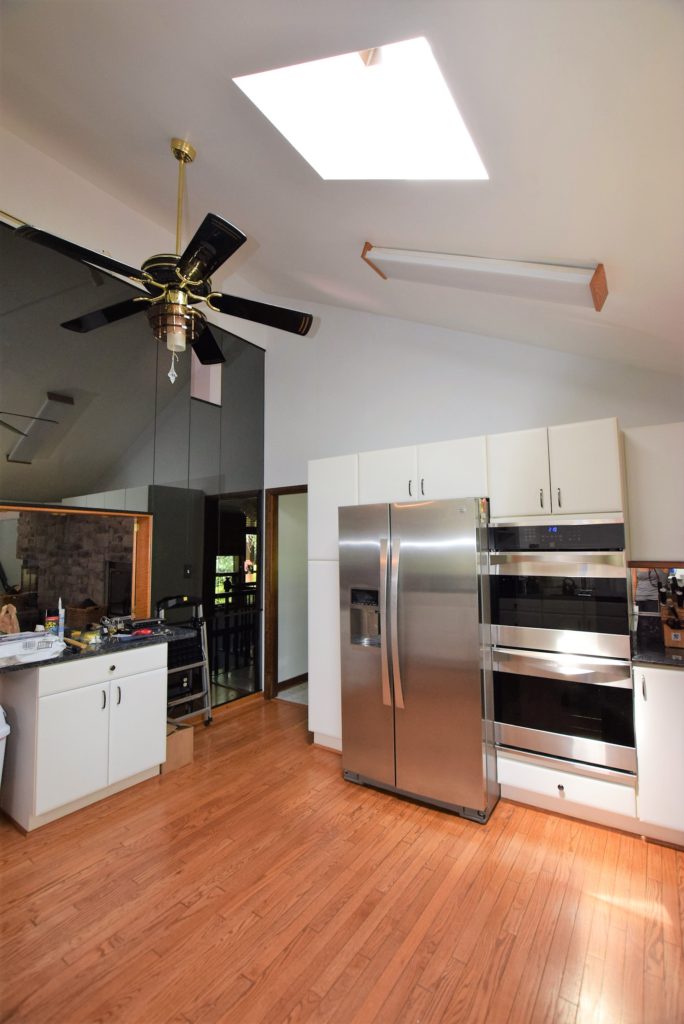
The adjoining kitchen is small by today’s standards. The dated white cabinets, oak flooring, leaky skylight, unintentionally retro ceiling fan, fluorescent lighting and a wall of black mirrored glass are all the things that need to change. To its benefit it does have nice granite counters and an updated fridge and wall ovens. The ancient ceramic cook top and mismatched dishwasher are also less than ideal.
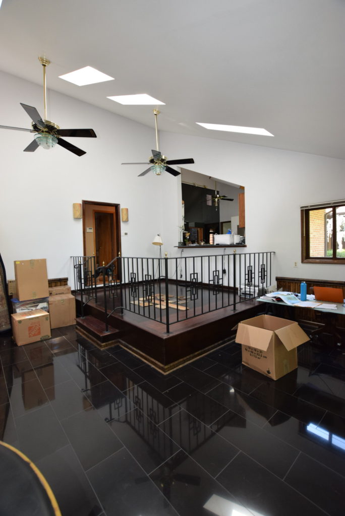
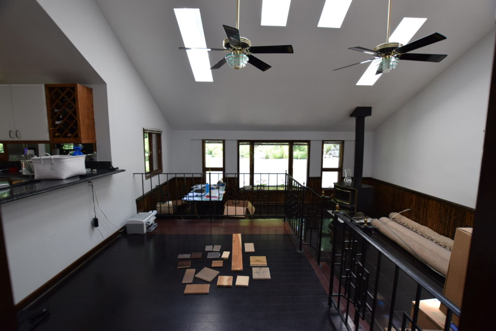
The hall next to the kitchen leads to another room with a raised platform that forms a bar to the kitchen cutout, but this platform makes the rest of the space in the room awkward and unusable. This room, which probably served as a family room, breakfast room has 3 different floors, black bamboo, red bamboo and glossy black granite. The vaulted ceiling is nice as are the skylights and the large front windows. We hope the woodburning stove will help with energy efficiency this winter. This room actually used to be a garage so when it was converted to living space room was “taken” for the electrical panels by building a awkward closet. The home has a number of electrical issues so as we fix them we’ll probably also relocate these panels since their current set-up is neither to code nor aesthetically pleasing.
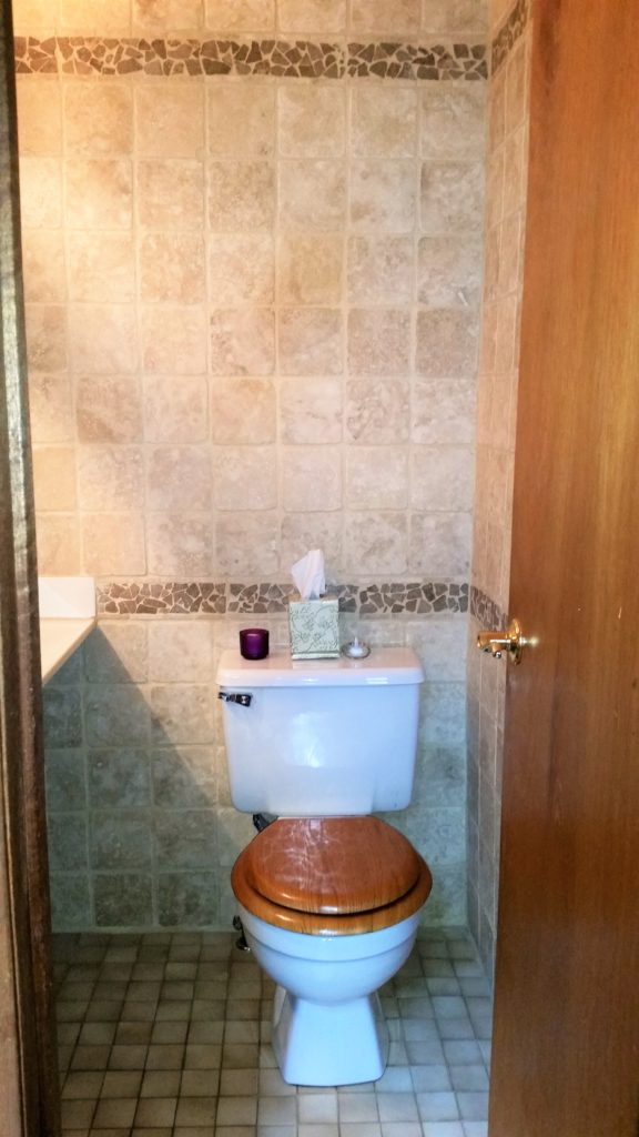
Across the hall from the family room is a powder room, with floor to ceiling travertine tile, dated sink cabinet and lighting and a toilet complete with a wooden toilet seat.
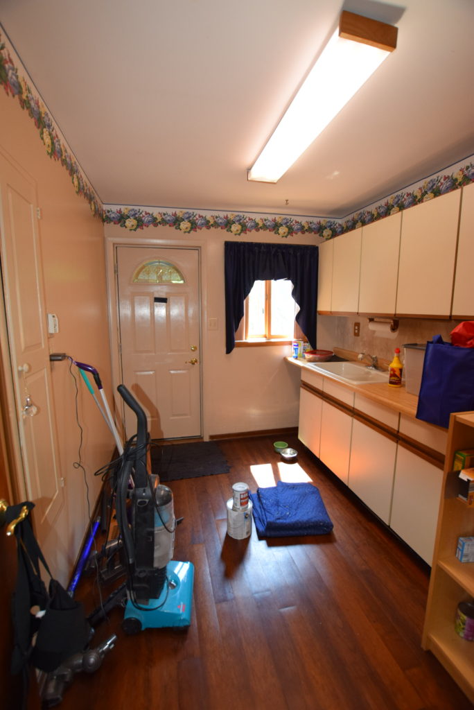
Next to the powder room is one of my favorite rooms in the house… well not in its current state… but I’ve been wanting a mudroom forever. Eventually this will be a mudroom/ laundry room with extra pantry style storage.
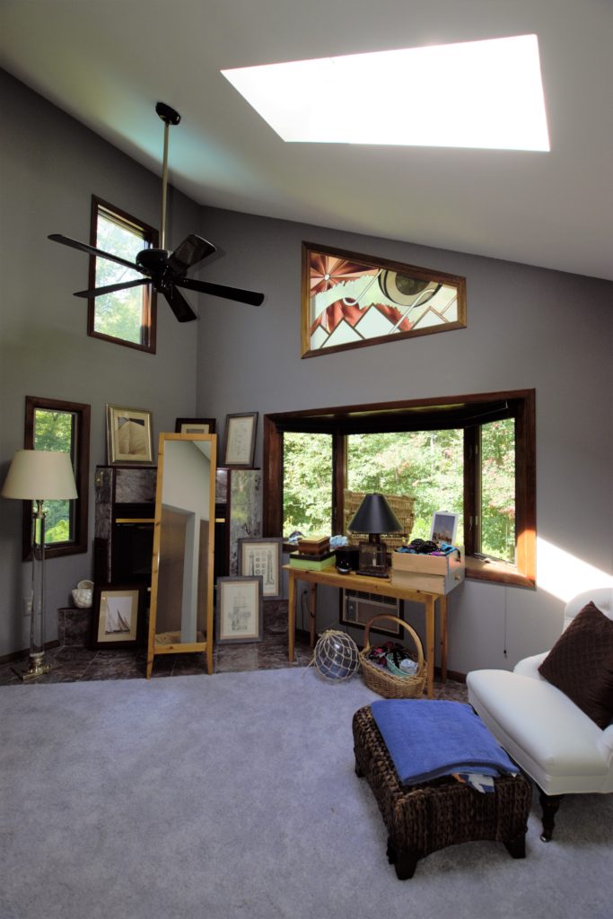
The final room on this side of the house is yet another living room type space, which we’ll call a den since we’ve already got a living room and a family room. Our hope is to not call it a den for long, we’d love to convert this room to the kitchen to maximize easy access to the back decks and the overall larger space. We’ll know this Friday when we meet with a structural engineer to tell us if these dreams can come true since some adjoining walls would need to come down and we’d want to vault this ceiling as well.
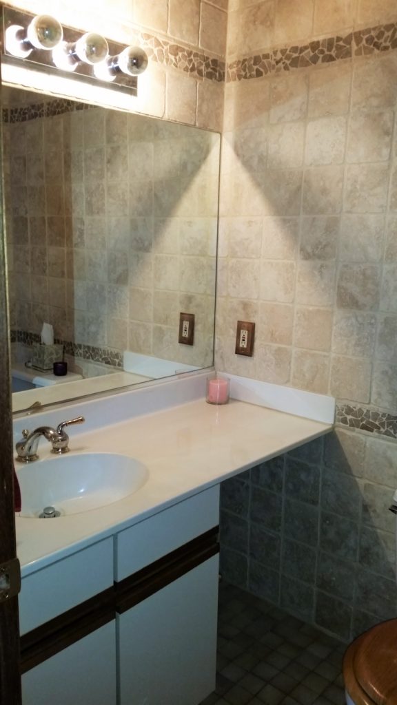
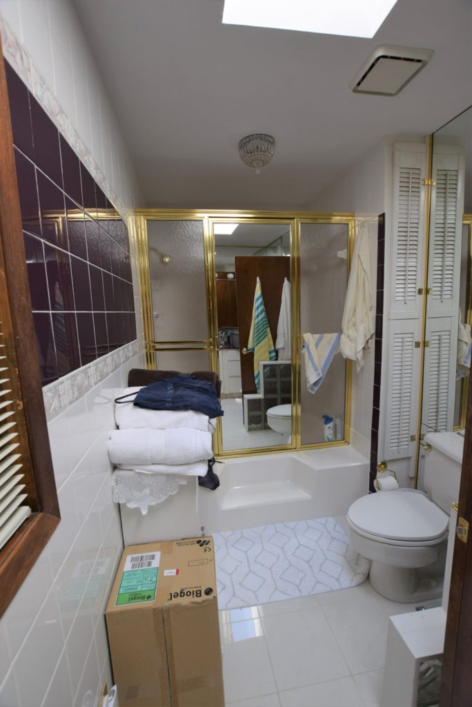
Across the other side of this level is the bedroom wing. The hallway has a coat closet (with mirrored doors of course) and leads to a bathroom and our daughter’s room. The bathroom isn’t too bad. Sure it’s got a grey toilet and tub, 4 different kinds of tile (to the ceiling no less), a worn vanity, dated lighting, a mirrored medicine cabinet on top of a wall mirror, old brass fixtures and a brass and glass shower enclosure. While we await for approval to knock down walls, I’ve taken on this bathroom and the nearby linen closet as my first pet projects. I’ll detail more in a future blog post so you can see my low-budget reno on this bathroom.
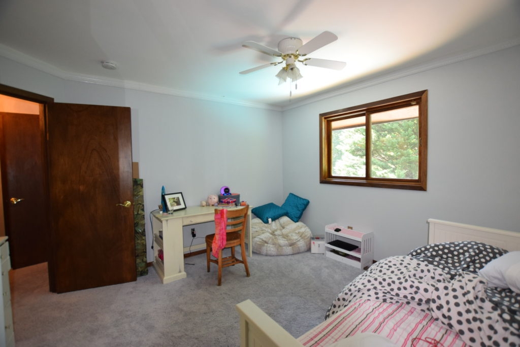
The 1st bedroom off the hall is my daughter’s and it’s a pretty standard bedroom. Smaller than her last but it overlooks the pool. We’ll eventually update it by replacing the traditional trim with something more contemporary, replace carpet with hardwood, new closet doors and paint. Pretty simple, right?
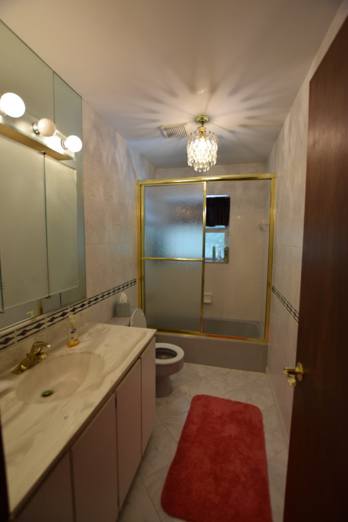
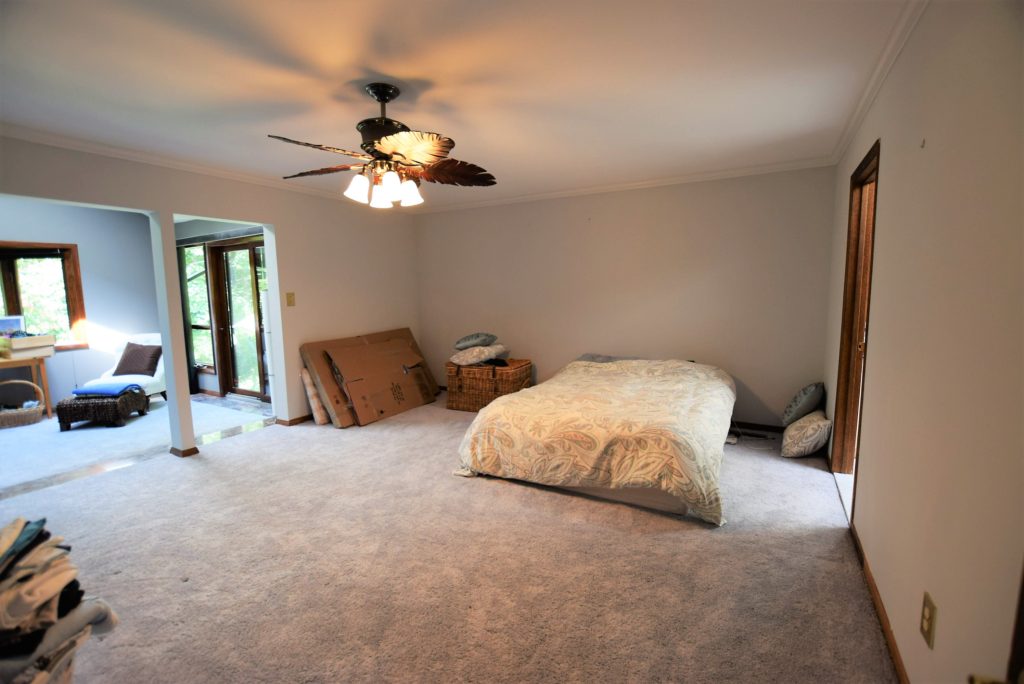
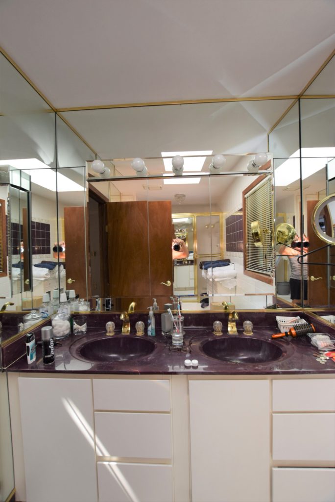
Finally, the master suite. It’s huge, thanks in part to an addition in which the previous owners added a room on top of an existing deck. However, this room currently seems to slope downward and features a gas fireplace that doesn’t seem to work, and burgundy and grey tile that is popping up unprovoked. It’s a good thing that this space is so large because we will need to borrow some space to make the master bathroom larger. The bath currently has gold framed shower doors, mirrors everywhere, some glass block and a plum purple sink and coordinating 80’s era tile on the walls.
That’s all for today, over the coming days I’ll take you on a tour of the basement and our favorite part of this property and the real reason we bought it, the outdoors. Of course if you have great design recommendations, put them in the comments and share with your friends and family!