Building a Dream: Our Vacation Rental Property Series #5

Designers and Floorplans

Rental season in the OBX is gearing up for us right now, so I’ve been busy with handling last minute crises like broken icemakers and area rug cleaning.  But four years ago, we were only concerned with making sure we created a home that fit both our family and our future rental clients.  We loved to peruse home design magazines that were filled with floorplans and websites where you can order a stock floorplan.  Initially, we thought that getting a custom home would be far too expensive and that we’d be stuck with a stock plan.  We were so wrong about that!  Our builder recommended a few designers, we perused examples of their past work online and ultimately went with his recommendation on who he thought would give us the result we were looking for.  In the end the design of the home was very affordable.  It cost us only about 1% of the total home cost and we got exactly what we wanted!

Personal Wish List

Our personal wish list included these design features:

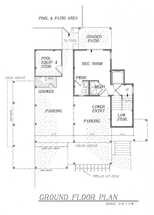
  • 5 Bedrooms, 4 + baths
  • A relatively small footprint at about 2500 sq. ft.
  • Efficient use of 2500 sq. ft. (i.e. no dead space)
  • An energy efficient “green” home
  • A pool
  • A bathroom at ground level for pool users
  • Built on stilts, a common thing for homes in OBX to avoid potential flooding. Even though our home was in an area at low risk for flood we wanted to go as tall as the HOA allowed in order to get any ocean views possible. *(more about this below)
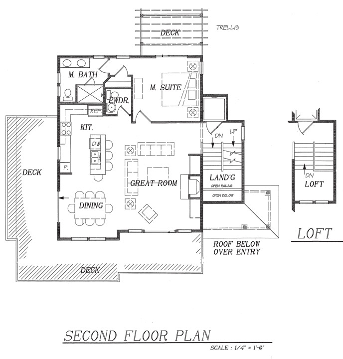
  • A reverse floorplan, meaning that the main living areas are on the top floor. Again, our goal was to maximize any potential ocean view.
  • Incorporation of a “ships watch.” Yep, you guessed it, highest potential area for views.
  • Stairs situated on the side of the home (center stairs, while popular, take up and break up open floor plans).
  • An open floor plan on the main living level.
  • A traditional beachy appearance on the exterior utilizing finishes like painted cedar shake and board and batten
  • Potential space for a future elevator (knowing that someday faaaaaar in the future it may be our retirement home, or at least more appealing for future buyers. Lugging up a weeks’ worth of groceries up 3 stories is NOT ideal.  Oh, the things we do for a glimpse of ocean!)
  • Highest ceilings we could possibly achieve with a 35’ HOA imposed roof height limit
  • Lockable storage

Vacation Renter’s Wish List

During this process, we also consulted with local property management companies to ensure that we created a home that would be “rentable”.  Therefore, we had some real requirements we felt we had to meet on top of our own personal wish-list.  Rental requirements included:

  • A home that sleeps at least 12. Many vacationers choose to rent homes with family or friends and pool resources, and for some reason a home that sleeps 12 is the “sweet-spot” of rentability / cost effectiveness for the OBX rental market.
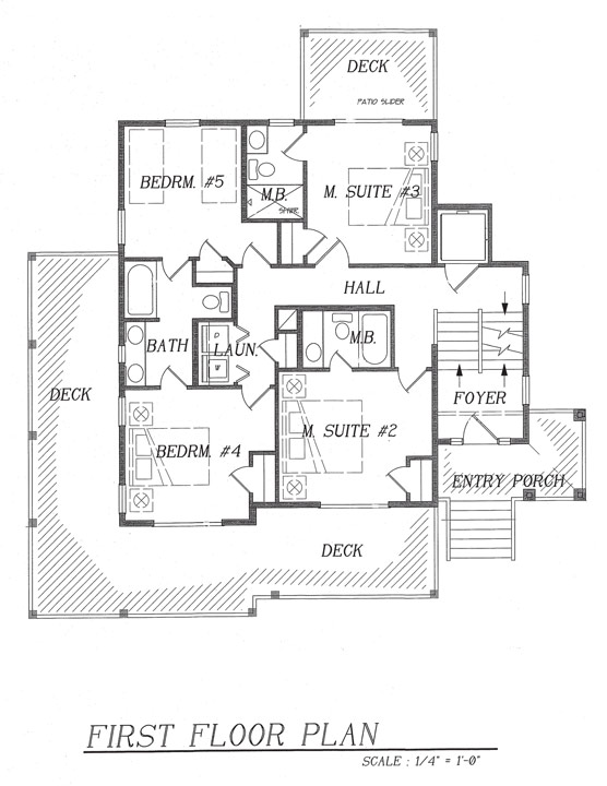
  • As many en-suite bedrooms as possible. So that families joined together on vacation can at least have a private bathroom.  We made 3 bedrooms en-suite and the other 2 share a jack and jill bathroom.
  • Room for as many king beds as possible. We were able to make 3 bedrooms king, 1 queen and then a kid’s bunk room with 4 twins.
  • A pool
  • A hot tub
  • An open, chef’s kitchen
  • A dining area that can seat as many as the home sleeps, so in this case, 12.
  • A rec room with a hang-out spot (most renters want a pool table, but we weren’t willing to make the lower level rec room big enough to hold a real pool table, so we made it large enough for a shuffle-board table, mini-bar, half bath and loveseat)
  • Parking for at least 5 cars
  • Outdoor living area

Whoa, that’s a lot of stuff to cram in 2500 square feet!  Thankfully the lists overlapped a bit, so we gave our requirements and some exterior sample photos to our designer and he came up with a perfect floorplan and use of space.  I recall us just working through a few tweaks here and there before we were ready to get cracking on the build!

Design-Build Firm, Designer or Architect?

We learned so much from this process, and it was fun!  Our major takeaways: When you are building at the beach there may be special building codes or just good practices so I highly recommend hiring a designer who is from the area where you are building and is familiar with both the codes and the concept of vacation rentals in that specific area.  A common misconception is that you have to hire an architect when in fact, a designer, in conjunction with an engineer can accomplish the same great design for your home!

To View or Not to View… That is the Question!!!

*A funny story about those views.  Our property is about 2 blocks from the beach, in a treed neighborhood with other homes between us and the beach.  We had absolutely NO IDEA if we’d build this house and have an ocean view.  All of our neighbors were smaller/ lower homes so there was no way we could ask them to stand on their deck and know if we’d get a view.  We attempted to duct tape our digital video camera on 40 feet of PVC pipe and raise it over the trees on the highest point on the property.  We did this in the presence of our designer and builder and they probably thought we were a  couple of nutjobs.  We may have felt legitimate had it worked, but it didn’t.  The resolution on our camera wasn’t good enough to see that far.  Maybe if we were building today we’d use a drone.  Anyway, we went into the design and build process knowing that all those requirements on our list for an ocean view may be for naught.   Spoiler-alert! In the end, from both the top deck, main living area and the ships watch we DID achieve the tiniest ocean view ever!  Even still, we love it, with all the windows and doors open it feels like a treehouse up there viewing bright blue skies through the tall live oaks and pines.  It’s heaven.
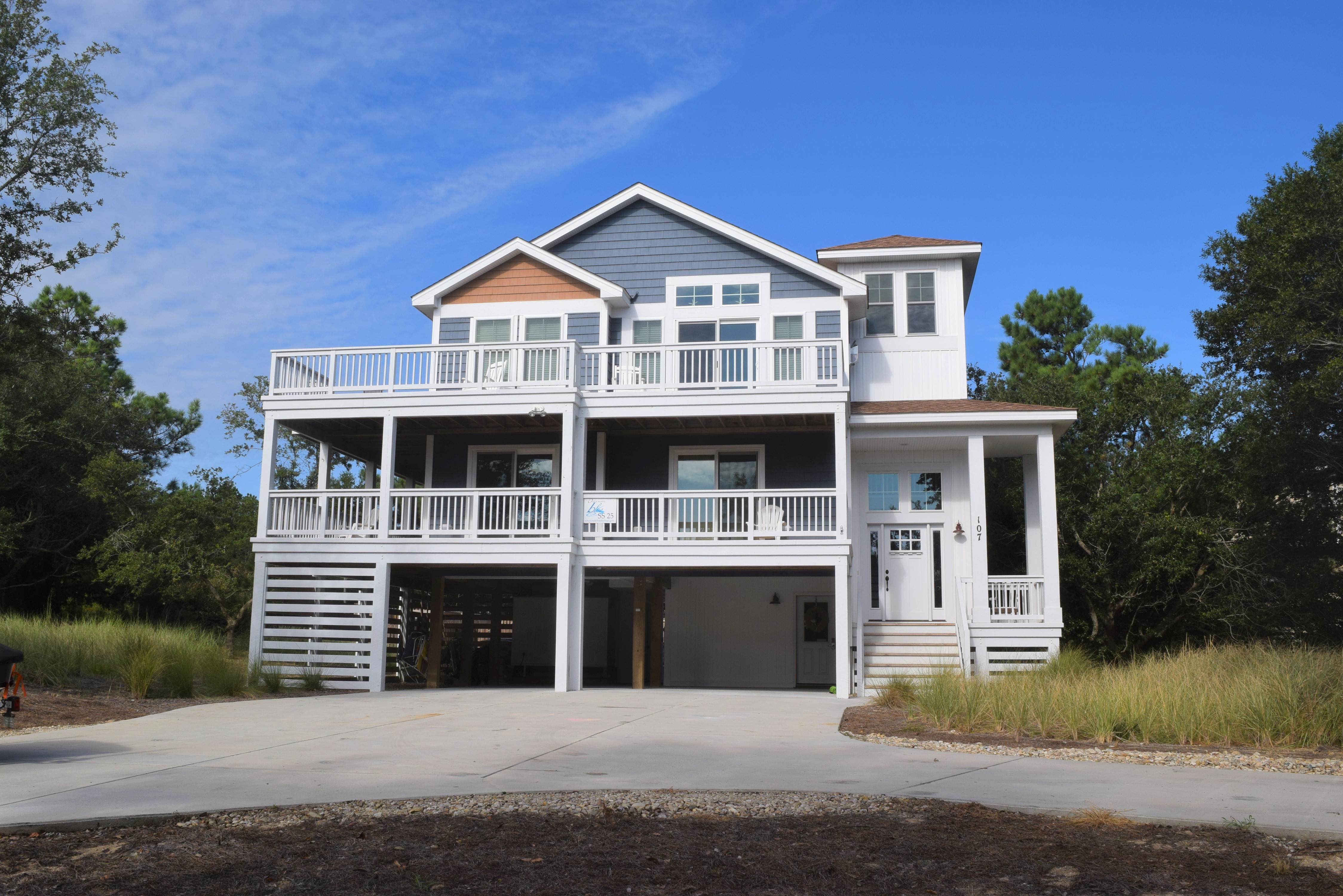
Our dream beach house in OBX!


dream beach house ground floor


dream beach house bedrooms


dream beach house floor plan

Building a Dream: Our Vacation Rental Property Series #4

Selecting a Builder

So hopefully you’ve been keeping up with the series and have heard about my family’s adventure in finding and building a vacation rental property.  We’ve discussed  looking for real estate, buying the land, and searching for a builder for our dream home in the Outer Banks of North Carolina.  In case you’ve missed any you can find those episodes by clicking the links here, here and here.  Ok, now that we’re all caught up, I want to pick up where I left off. We had just sent the looooooong questionnaire to 3 builders and were eagerly awaiting their replies.  Each of their responses couldn’t have been more different.  Builder A, who could better be termed as a developer (which is a rarity in OBX since the community is relatively small), answered all of our questions and also took me on a tour of one of their homes and created a several-page-long packet showing us what we could get for our budget including selections of floorplan, finishes, etc.  Builder B, who is known for being OBX’s “green” builder also responded by answering each of our questions thoroughly and followed up with a phone call as well.  Finally, Builder C opted to not respond to our questions in full but rather called us and attempted to sell us on his services.

After reviewing these 3 very different responses, our selection was evident.  We decided were not at all interested in working with a developer (Builder A) who would only allow us to select certain cabinets from a certain company in a prescribed finish.  Also, when I was taken on a tour, the rep from Builder A picked me up in a dirty minivan and it was just a real turnoff.  If your business is trying to win a client who’s about to plop down about a half mil to build a custom home, at least have the tour guide vacuum out their car – I would have even preferred if the rep had hopped in my car.  Builder C who didn’t even “have the time” to respond to all of our questions as we had asked (even though he probably was the least expensive option) was obviously out.

The builder we did select, Builder B, not only answered all of our questions but we were also happy to have green, eco-friendly expertise available at our fingertips.  He was also willing to consider any “oddball” thing we brought up, like building a pre-fab home, which he had never done (ultimately, we decided against this because of all of the strict building codes for coastal, hurricane resistant homes would have negated the cost effectiveness).  He was open to us being as involved as we wanted to be or could be given our long distance during the building process.  He was not at all pushy, and just seemed to be a regular, down to earth, experienced and nice guy.  Above all, what we valued most was that he was responsive.  If we asked a question, he answered either via email or text within hours.  If we called him he called us back.  You may be thinking, “duh”, since it’s sort of important thing for a business-owner to return their client’s inquiries, right?  You’d be surprised.  Maybe it’s a regional thing.  We had high expectations.  At the time, both my husband and I worked in Washington DC’s fast paced Federal Government Contracting industry in which we competed fiercely for our client’s business.  Certainly, the mindset in OBX is not as competitive, it’s MUCH more laid back (as we’d learn in our dealing with other vendors).  We knew we’d be most happy working with a builder who was client oriented.

We made our builder selection while we were searching for land which I highly recommend.  Our builder came with me to plots of land to help us select the right one for building and met with us separately to discuss budget, pools, architects, and floorplans before we ever even signed a contract. Selecting the right builder is SO important.  I think we definitely made an excellent choice.  Our builder managed the project from start to finish, was responsive, provided impeccable workmanship and quality control, and gave us our dream beach house and meanwhile made the whole experience positive and enjoyable.

Next installment in the series we’ll talk about floorplans, architects and custom versus cookie cutter.

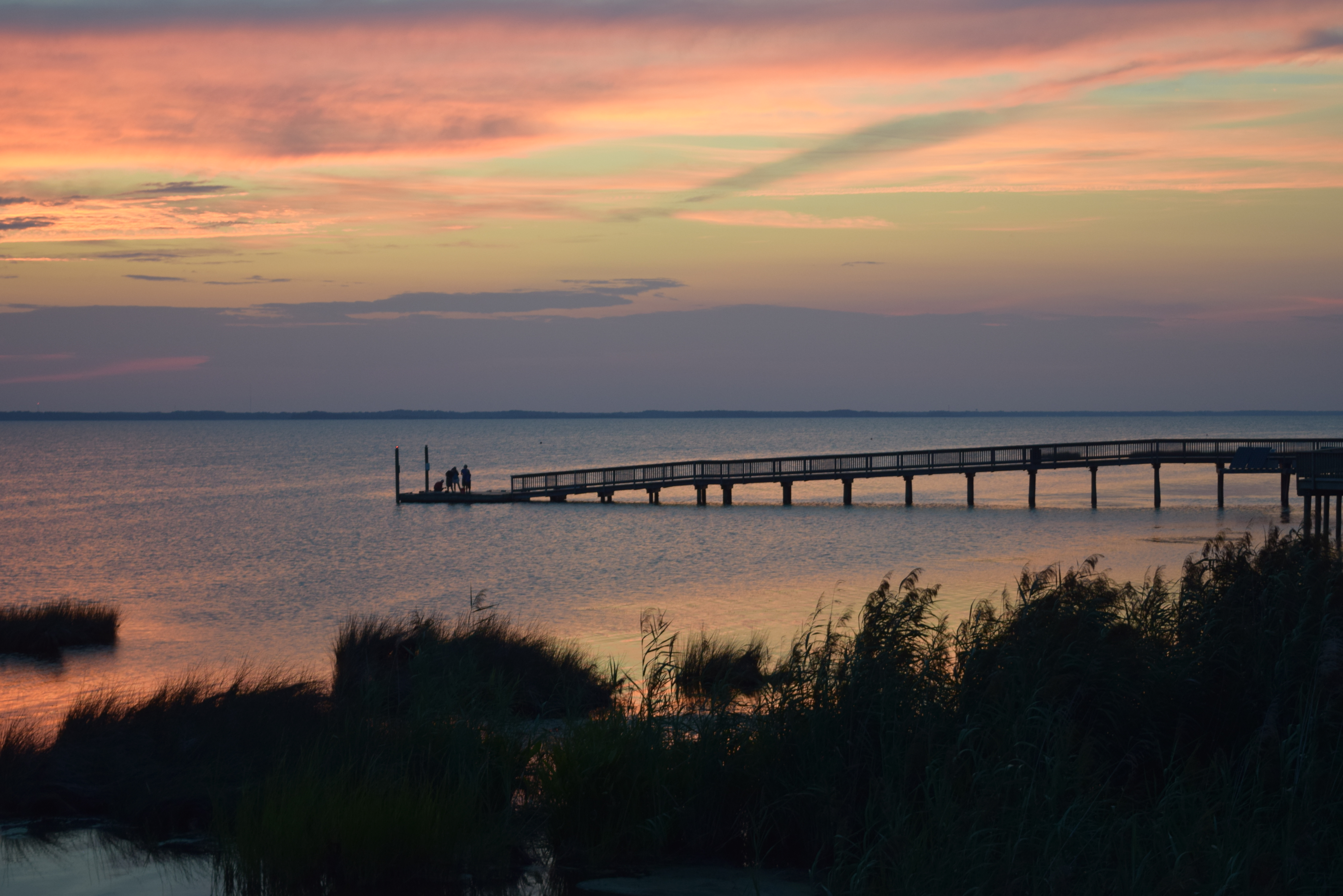
Serene view of Currituck Sound in Duck, NC

Eco-Friendly Farm House

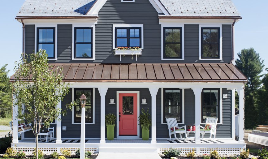
In this month’s edition of This Old House Magazine, they’ve featured a home that I think is almost absolute perfection (for me, it would be absolutely perfect if it were on a larger piece of land).  This Old House’s 2016 Idea House is a newly built farmhouse that’s a modern version of classic farmhouse style, with lots of green features and a smaller footprint…. not the McMansion size of yester-decade, nor the tiny mouse-house size, but a Goldilocks just right size of 1900 square feet.  Here’s some of what I really love about this place.

First, the outside look is just so appealing and charming, with the copper roof over the porch, the black vinyl windows and that salmon door is just so inviting! Sometimes it’s also what’s NOT present that can improve curb appeal, in this case, garage doors, which are located in a detached garage at the back of the property.

toh-exterior


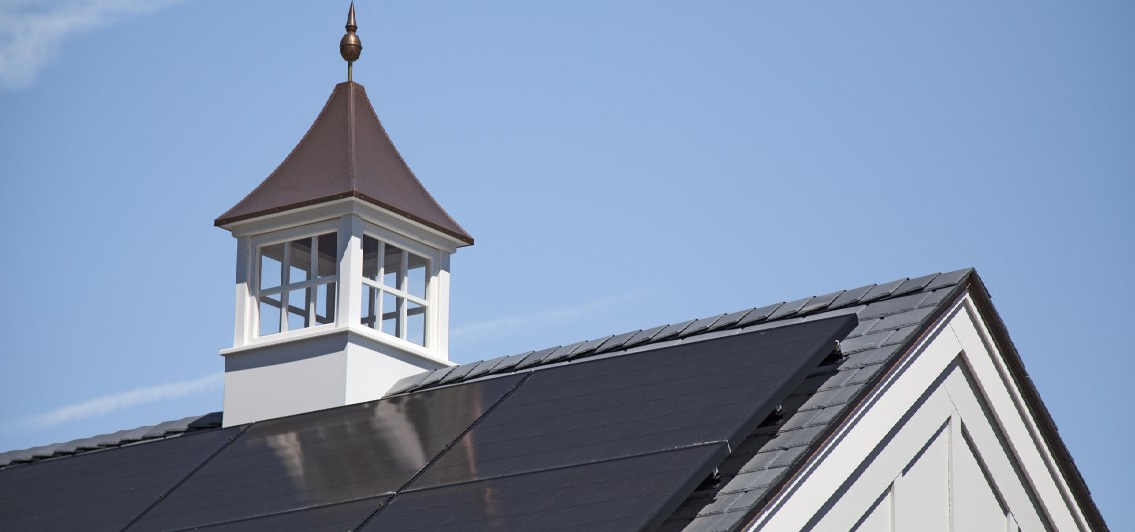
This house uses less than half the energy of what the average house of a similar size would consume, thanks in part to the solar array on the roof of the garage.  Sure, it requires an investment up front, but if you plan on living in the home for a while, live in a state that offers tax advantages for eco-friendly home improvements, and idealistically want a better planet for your kids, then solar is the way to go.  Plus, who could resist an adorable cupola?

cuploa-and-solar


I’ve always thought rain chains were a charming feature of older homes, but I never considered their eco-friendliness before.  The rain chain channels the water to a bell cup and releases it in a controlled fashion down the chain to the awaiting garden, or terminates in a cistern where water can be used for watering plants later.

rain-chain


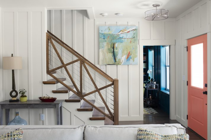
The inside of the home has some wonderfully modern yet charming features as well.  This baluster and railing system is amazing.  And can we talk about that board and batten on the interior for a minute?  It adds so much visual interest, and the white keeps the room bright and airy.  From a practical standpoint, the board and batten can be painted in a semi-gloss, since it’s technically a “trim” and will be so much easier to wipe down when dirty or scuffed which is perfect for a smaller space that is inhabited by kids and pets.  I’ve been seriously considering a board and batten for this very purpose up and down the stairs and halls of my rental beach property, I may be thoroughly convinced now.

toh-railing


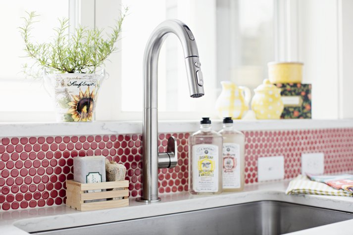
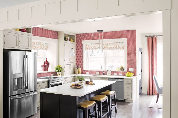
I’ve always wanted a reason to use penny tile and I just haven’t found the right place for it yet.  I like that the designer of this space not only went with the penny tile but went bold and selected a red shade with bright white grout.  It’s a classic look that shouts “farmhouse!”

toh-red-penny-round


It’s a small kitchen, but taking the tile all the way to the ceiling adds visual height and space and the oversized contrasting island adds all the usable storage, counter and seating space a growing family could need.

toh-kitchen


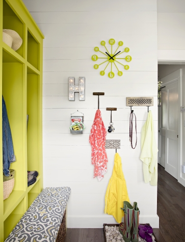
Even though most of us don’t live down on the farm, everyone these days still wants a mudroom.  And if it looks like this, well, who wouldn’t?  The bold citron cubbies paired with the dark wood floors and the white shiplap walls welcomes the entering  family with a vibe that says, “organize your crap”, but “still have fun”.

toh-mudroom


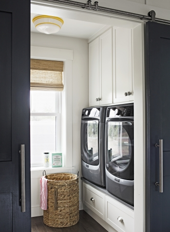
I might actually LIKE doing laundry if it were in a laundry room like this.  Ok, admittedly, I’d probably still not like it, but at least I wouldn’t cringe every time I walked past my laundry room. Now on my to-do list, revamp laundry room and include a barn door.

toh-laundry


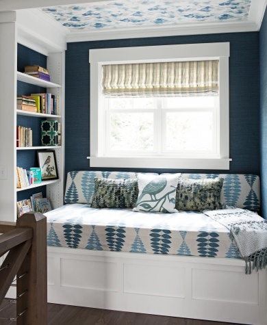
Navy blue and crisp white is a tried and true design trick that looks fresh and clean every.single.time.  I don’t think you can ever go wrong with navy and white.  This reading nook capitalizes on the navy and white perfection and takes it one step further by adding additional visual interest on the ceiling with a blue and white patterned wallpaper.

toh-windoseat


All the related articles and photos, all by William Geddes can be found at This Old House’s website, here. What’s your favorite part of the This Old House Idea House 2016?