New Year, New HGTV Dream Home

HGTV’s 2018 Dream Home

It wouldn’t be the start of a new year without a review of the highs and lows of the HGTV Dream Home.  The unveiling of the 2018 HGTV Dream Home was just one small thing to look forward to the night before everyone trudged back to work and school today.  As with the last several years of Dream Homes this one was also a renovation rather than a complete new build, because ya know, who can resist a stunning before and after?  I was particularly excited by this year’s contemporary style since it’s a similar style to my home that we’ve been slowly remodeling over the last few months.

Before, Exterior

The HGTV 2018 Dream Home is located in the Pacific Northwest, right along the Puget Sound.  The setting is gorgeous.  The previous exterior, not so much.  Let me rephrase, it wasn’t awful, just a bit outdated and weird.  What’s up with that asymmetrical ship’s watch?  My guess would be that similar to our home, this one was originally built in the mid-80’s.
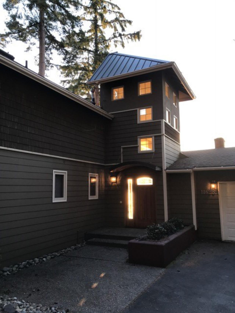
dream home exterior

The back of the home looks slightly better, but all you see if building block looking windows, stark white railing, and too-big arborvitae bushes hiding the wall.
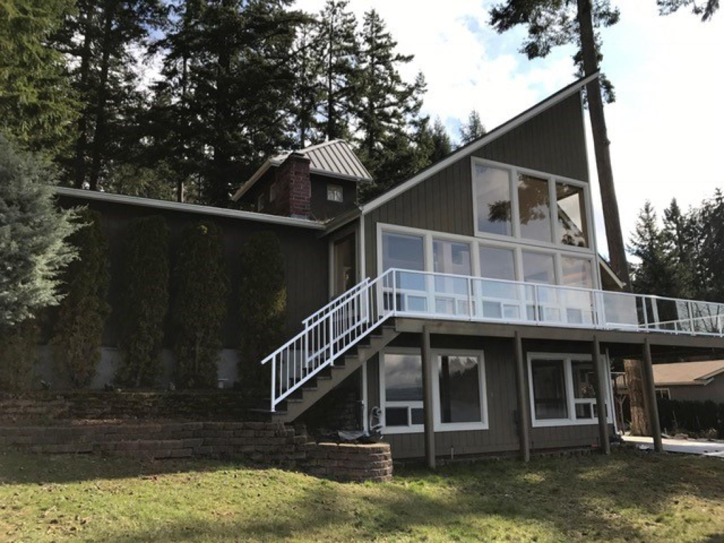
exterior before

After, Exterior

The after is much improved, sleek and truly contemporary.  None of that “I am a contemporary but would rather be coastal” that it previously possessed.  The metal roof over the entire home probably cost a pretty penny (I’ve been researching them as a possibility for my own home) but makes such a difference.  Removing that ship’s watch was also a great choice and the updated driveway, garage doors and landscaping don’t hurt either.
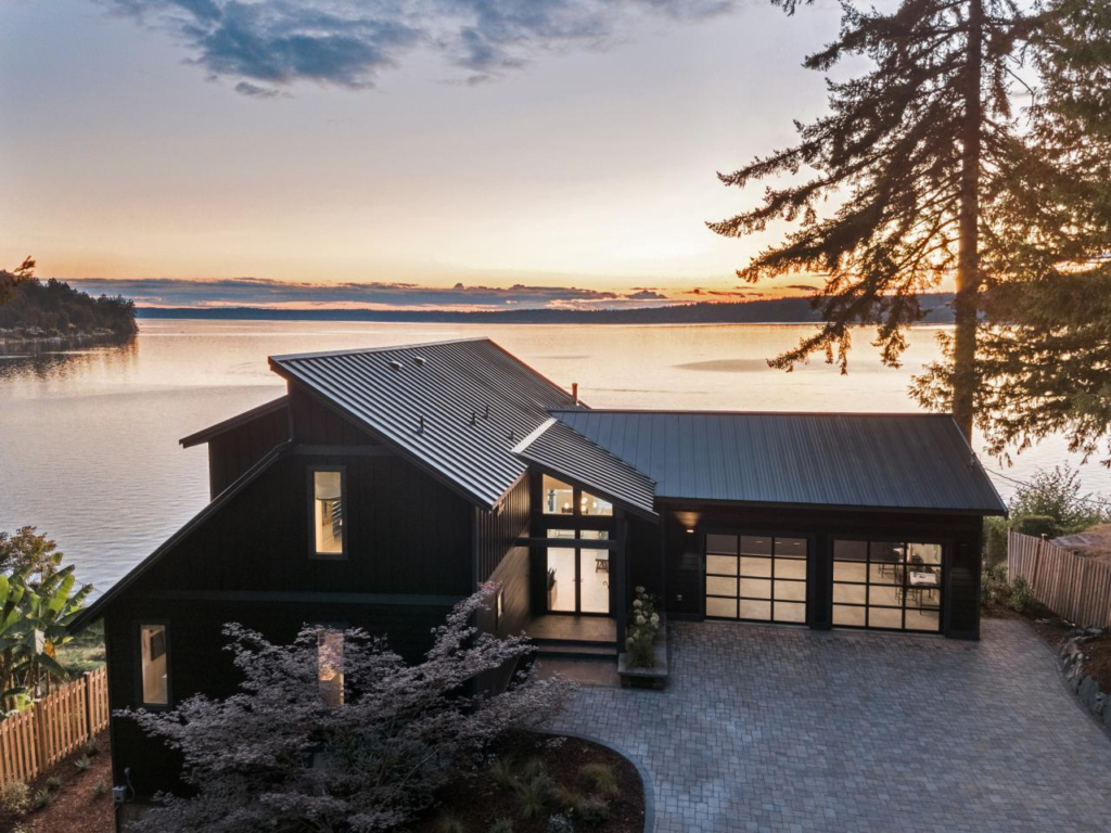
after exterior dream home

This home is just reaffirming many of the contemporary design choices we’re making for our own home, and the black modern windows and dark painted exterior help immensely.  I wish HGTV would name all of their products somewhere and the cost for the product and the installation and construction. I’ve found that black (interior and exterior) windows are not as readily available as one might think, and when you can find slick black contemporary windows, they are $$$$!
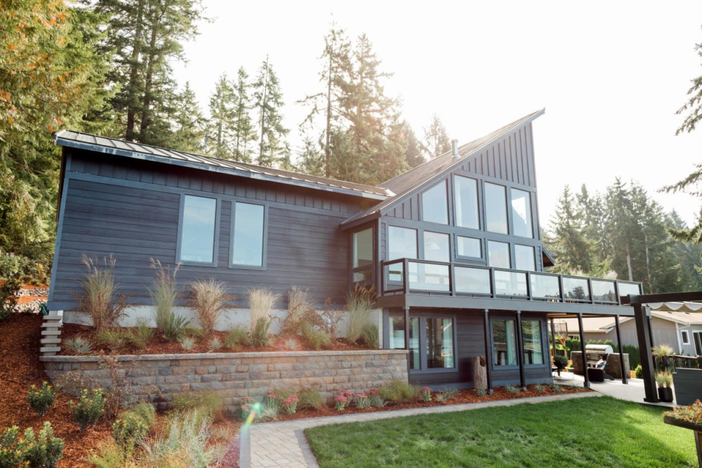
black windows

Dream Home Interior

I won’t bore you with all of the choppy wrong-ness of the before interiors, you can check them out for yourself on HGTV’s website but I did want to take you through some of my favorite parts of the completed interior.

Ok, here the view says it all, and perhaps that’s why they chose not to go with black interiors on the windows here but rather white with white trim? The millwork is simple and contemporary and honestly fades away unless you’re really looking for it, making the Puget Sound views the main event.
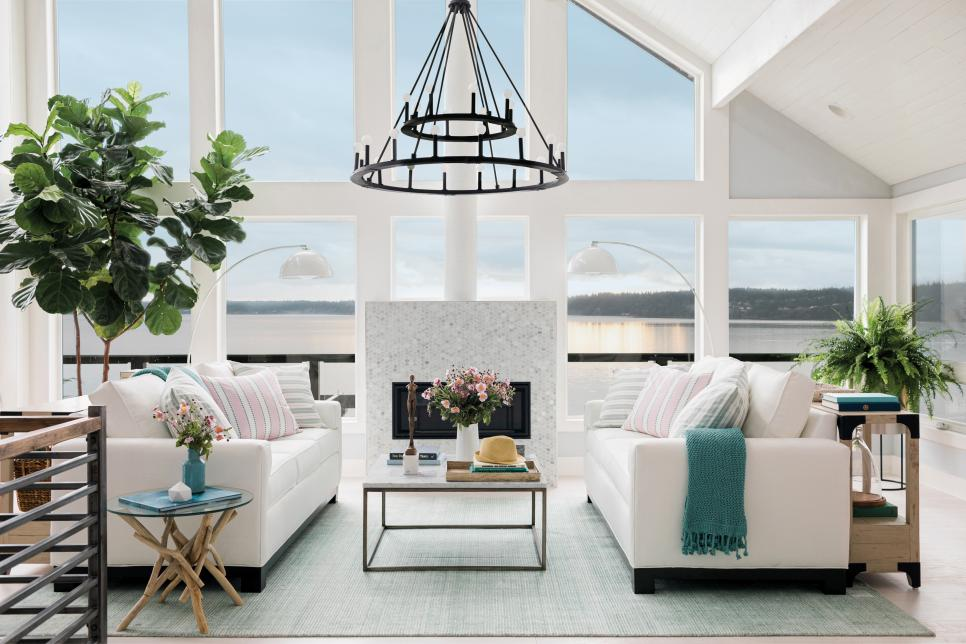
great room

I’m torn about the fireplace placement.  On one hand it’s ideal to have your great room furniture be focused on both the fireplace and the views all at once, but a fireplace of this size does take up a good portion of that view.  And while the look of this one is very coastal, I’d have gone with something a bit more contemporary that didn’t take up so much real estate, like this one here by Malm.
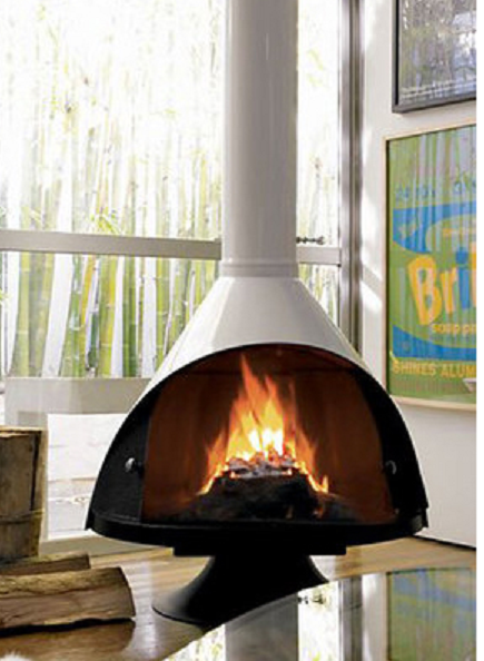
suspended fireplace

I am still a sucker for a white kitchen, and I really love that they are using a shaker cabinet in a contemporary home.  (More positive design affirmations for my home – yay)! The metal and wood railing are perfect and add the modern edge while the white wicker pendants over the island give it just enough coastal kitsch.  I may need to pick up these counter stools for my own home.
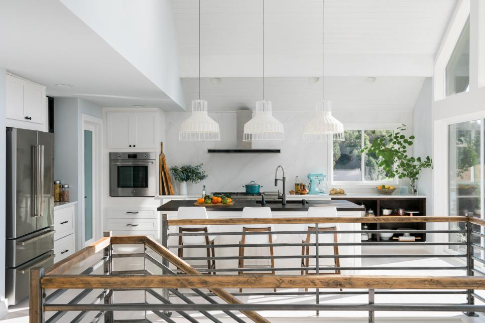
kitchen modern coastal

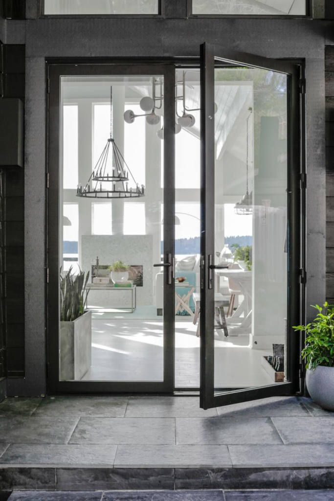
This entry door is perfection.  You can see in the second pic below it’s a very modern black interior/exterior French door.  I am hoping that this is what our new Marvin Contemporary door will look like in our in-progress kitchen. It’s harder to find modern looking French doors without mullions than you think.  They are not a standard off the shelf Home Depot purchase, trust me.  I’m a bit disappointed by the random hooks just hung on the wall with no framing or bench.  The hooks themselves are adorable whale tails but I wish this wall had been framed out (maybe with some board and batten) so that the coats weren’t the focus. The art is gorgeous though hung at a weird spot, probably to detract your eye from random coats.  And the idea of a burled wood boot tray in the Pacific Northwest is a smart and good-looking idea.
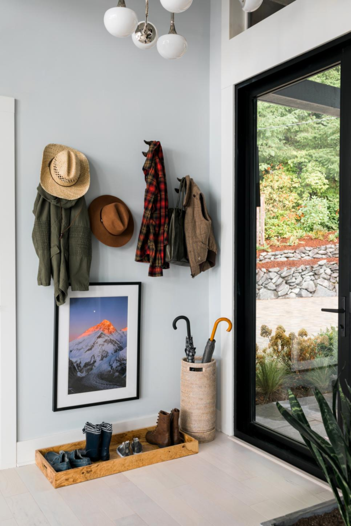
contemporary doors

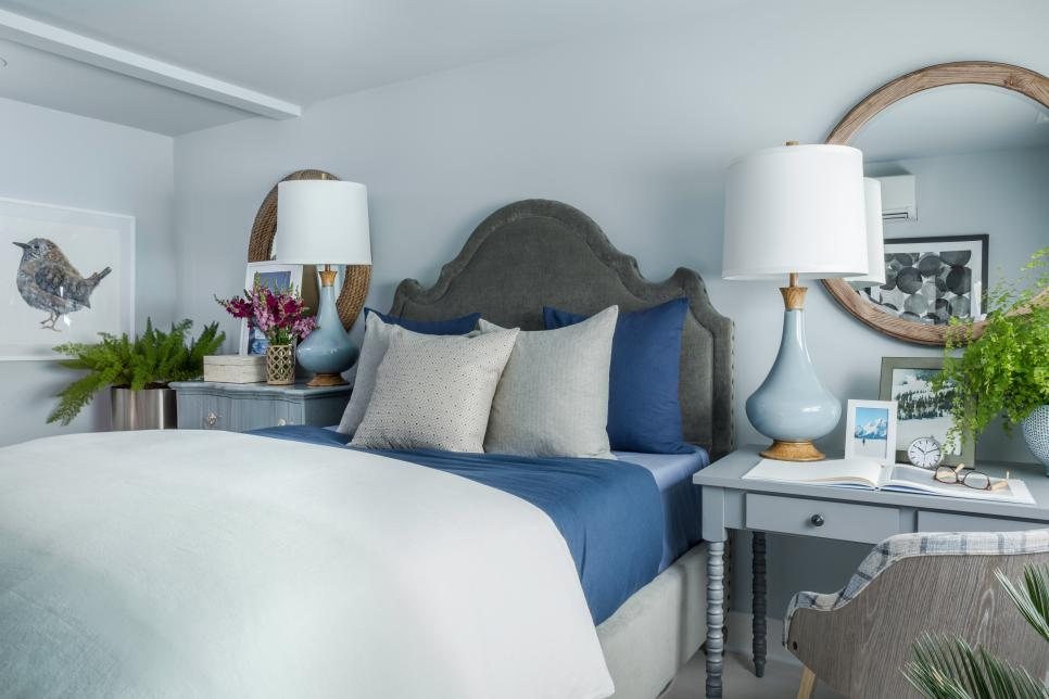
In my opinion this is the best bedroom of the bunch.  The blues are calming, but not boring, and this is a great example of how things don’t need to be perfectly matchy-matchy but can still “go.”  See how those mirrors are similar but not the same, and the desk and dresser, too?  I also like how larger furnishings are used as nightstands.  Lots of folks don’t have room for a bed, nightstands and a desk and dresser in their room.  So it makes perfect sense to replace some of the less utilitarian pieces with those that can do double duty.
blue grey bedroom

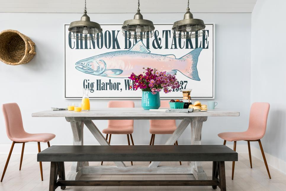
There are so many things I like about this vignette even though I don’t love pink.  I adore large scale art.  I love this fish sign and it fits this house outside Seattle perfectly.  My other faves here are mixing dining chars with a bench, the mismatched table and bench and  the pendant trifecta.  There is so much interest and mixing of styles here that you don’t even really miss an area rug under the table… ok maybe I miss one just a little…
large art

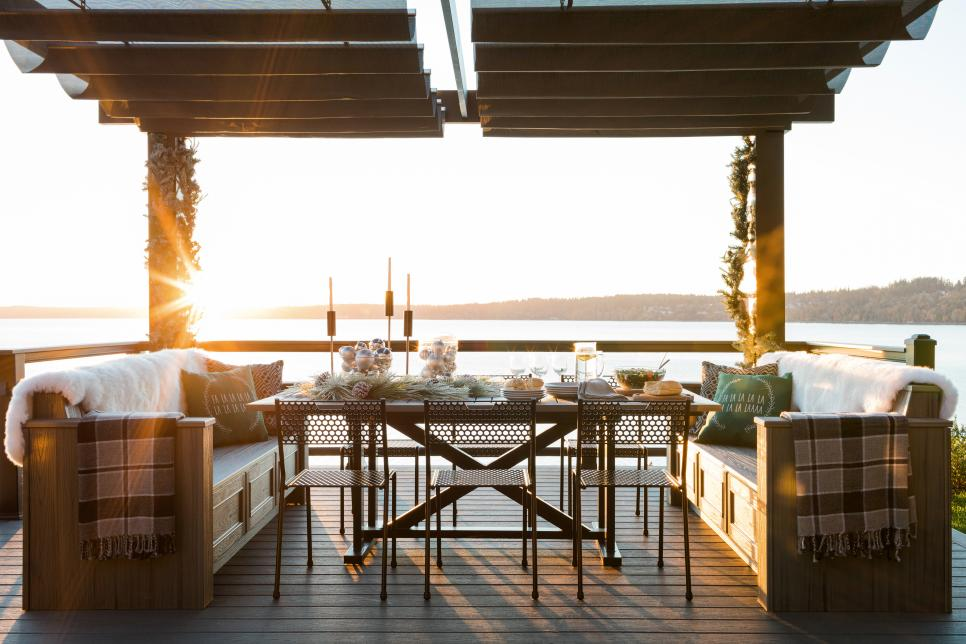
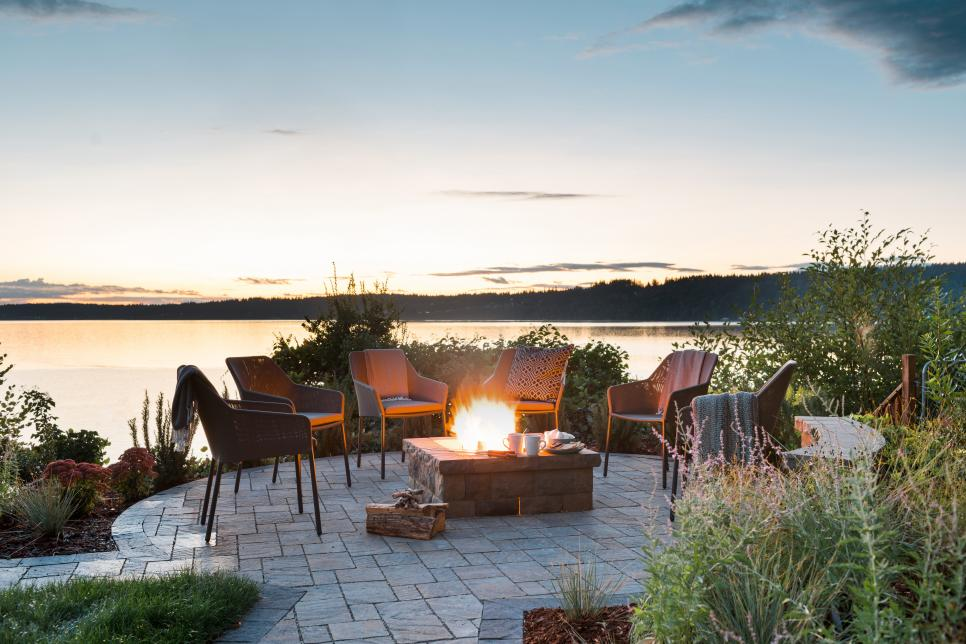
Finally, the outdoors.  The view from this property is just amazing.  And while it may rain a ton in the Pacific Northwest, for those times when it is nice enough to be outside, it helps when it looks like this space.  Who wouldn’t want to snuggle up next to that fire pit or have a meal with family and friends at that outdoor table?

Outdoor Entertaining Spaces
hgtv dream home

hgtv dream home

And HGTV, if you’re reading, here’s what I really wanna know:

1) How much does everything cost? Like regular retail cost that your everyday person would pay?

2) How much time does it take Ryan Patrick Flynn to design all these spaces?  How large is his team?

3) Next year can you create a list where everything came from. I mean everything.  Shingles, doors, windows, counters, light fixtures, a duvet, everything.  Not just those that pay sponsorship.  It doesn’t have to be emblazoned anywhere, just a list, no logos, no ads.

4) How much did you pay for the fixer initially?  How much did you put into it (labor and materials)?  What’s it worth now?

What were your favorite parts of the 2018 HGTV Dream Home?  What do you want to know about the HGTV Dream Home?  Lemme know in the comments, maybe we could get a petition going 😉

Marvelous Architecture of Martha’s Vineyard

Ugggh.  I am so guilty and feel terrible that I haven’t created a blog post in such a long time!  Sorry!  It all started back in early June.  First my husband was surprised to find out that the Army was promoting him.  So planning for a ceremony and party occupied a bit of our free time, then on top of that excitement we decided to make an offer on a house we liked, which ultimately resulted in us having to get our house ready to put on the market, an offer from the military to move to Italy (which we ultimately turned down), and celebrating my son’s graduation from 8th grade, and both my husband and my birthdays within 2 days of each other…. June was a whirlwind and July hasn’t been much better.

Thankfully there was 4 days of respite amongst all of it.  My husband surprised me with a trip to Martha’s Vineyard for my 40th birthday!  I had never been there but had read several books that are set in the relaxed, upscale, posh island.  Besides spending some time lying on a beach I was most looking forward to perusing the streets taking in all the great shingle clad architecture.  Martha did not disappoint!  Architecture ogling started as soon as our little plane touched down.  The airport with its whitewalls natural wood shiplap ceiling, detailed beams complete with turnbuckles offered a worthy welcome to this picturesque little island.  Check out those beams!

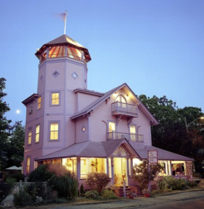
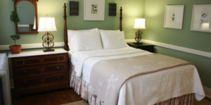
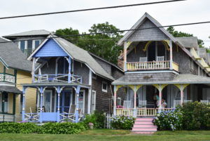
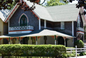
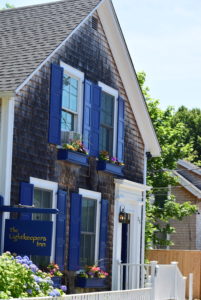
I really expected to see more grand homes with lots of weathered gray cedar shake siding, and while those did exist I think some of the large compounds were tucked away in the meandering woods of the island so their residents can enjoy privacy.  I was so surprised to find lane upon lane of adorable little Victorians dripping in gingerbread details.  The first sample of vintage Victorian architecture was our little B&B, the Oak Bluffs Inn.  Painted in pretty pastel shades of blue, lavender and pink it was a quintessential Victorian with seashore inspired antiques decorating the inside.  Our little cottage was a separate building in the back yard and was simply appointed and perfect for relaxing.  Very private and no TV.

oak bluffs inn

Save

oak bluff inn carriage house

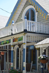
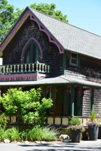
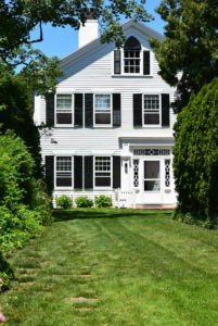
A few blocks over the Victorian delight continued with tons of shaded streets lined with adorable doll house like seasonal residences.  The area known as the Martha’s Vineyard Camp Meeting Association (MVCMA) is a community ripe with adorable Victorian homes in every color of the rainbow.


And yes, the parks, beaches, and lighthouses were gorgeous and every meal we had was excellent – so many great restaurants to choose from.  I’d go back to Martha’s Vineyard in a heartbeat.  Alas a return trip will have to wait because, fingers crossed, if everything goes well in the next month or so we’ll be moving! Stay tuned!  In the meantime, amidst purging and packing I promise to be better about blogging regularly and will share some highlights and ideas from some of my recent clients and moving tips too!

Save

Going Grey

This post could be about the slow transformation of my hair and how I spend five minutes every night plucking those greys from my scalp. (Yes, I’m aware it’s a no-no to do that.  I keep promising to stop…. I will… maybe…. when I’m bald.)  Anyway, thankfully, I’d much rather discuss the grey floor trend.  I went floor shopping yesterday with a friend and client.  She ultimately decided on a smooth medium grey hickory engineered wood.  It’s gorgeous.  It’s a great choice for her home in a neighborhood of classic brick ramblers.  It will hold up well to pets.  It will be a solid backdrop for her classic coastal inspired design, but will still be able to pull off other looks if she decides to change the décor down the road.

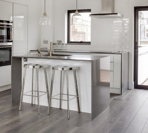
Grey made a serious comeback in interiors a few years ago and it’s meandering its way through our homes.  It began with the light grey or, even better, greige wall paint and morphed into grey-washed furniture a la Restoration Hardware, then grey creeped onto kitchen cabinets and now it has puddled on the floors.  That may sound negative; it’s not.  I like grey.  The floors in my own beach cottage are grey.  However, this color can be tough to find exactly what you want and more importantly to decide if it’s something you’re going to love forever.  Here are a few examples of some rooms where the grey floors did exactly what they were supposed to, be the backdrop for spectacular design.

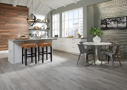
This first one happens to be an engineered wide wood plank called Braided River Driftwood Oak by The Reclaimed Flooring Co.

braided-river-1


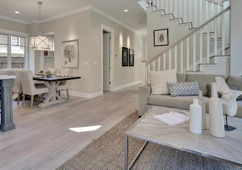
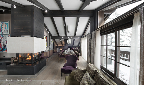
These in a design by Fiorella Design are Antique White by DuChateau Floors.  This is a less grey take on grey, if that makes sense, as a lot of the wood’s natural light brown color still comes through.

white-oak-again


If going for a super durable option, this floor is tile that looks like wood, and it’s very affordable.  This is Oceanside Oak Grey HD Porcelain.  available at Lumber Liquidators.

P.S. Flooring stores, we know you want to highlight those gorgeous floors but it’s okay to put an area rug in the styling of the photos.  It’s what people actually will do (or should do) when they put the product in their home.

oceanside-oak-3


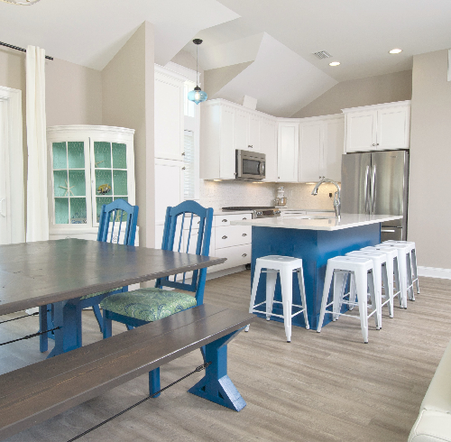
Most people when they think of vinyl they think, ew, that stuff that was rolled out by the miles in every kitchen and bath between 1965 and 2000?  Nope, this is not granny’s vinyl.  The new Luxury Vinyl Planks look like wood and wear better especially in very harsh environments like beach homes and commercial applications.  This is Bali by Beaulieu America in a dining and kitchen space I designed two years ago.

chicahauk


Now if you have a boatload of cash sitting around or really just want one splurge item, you can go with the real deal – reclaimed barnwood.  These beauties are Continental Oak by Ebony and Co.

ebony-and-co-5


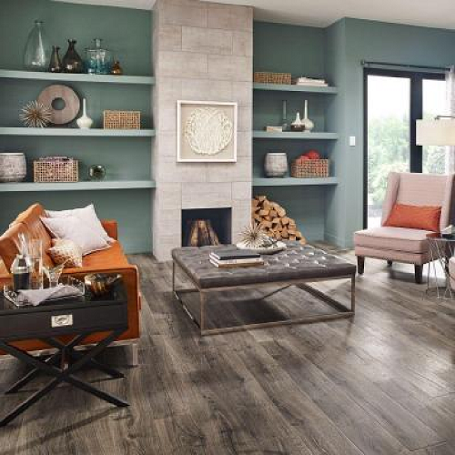
Those of us with the smallest of budgets probably have the most options in laminates because there are a ton of grey laminates out there.  DIYers can pick up the Pergo Vintage Pewter Oak, which is a dark woodsy grey, at Home Depot.

pergo-vintage-pewter-6