Bye Bye Brass

Builders across the United States must’ve all come together at some point in the 80’s and declared, “From this point forth at least 95% of all homes shall hereby have absolutely hideous shiny brass knobs or door handles, no matter how ugly it looks.”  Maybe they had stock in fake brass.  Is fake brass a traded commodity like gold or silver? Hmmm. I may be on to something here.  Anyway, I have never met a single person that actually likes these fixtures, and yet most of America is stuck looking at its gaudy gold-ness every time they enter or leave a room.  Making a change to something more modern can be a significant investment.  If I were to buy new fixtures for every door in my house it would have cost me over 800 dollars to replace them all.  There has to be a better way.  When in doubt, if you want to make something look better, paint it.  Here’s how to take your unsightly shiny brass into serious style, step by step.

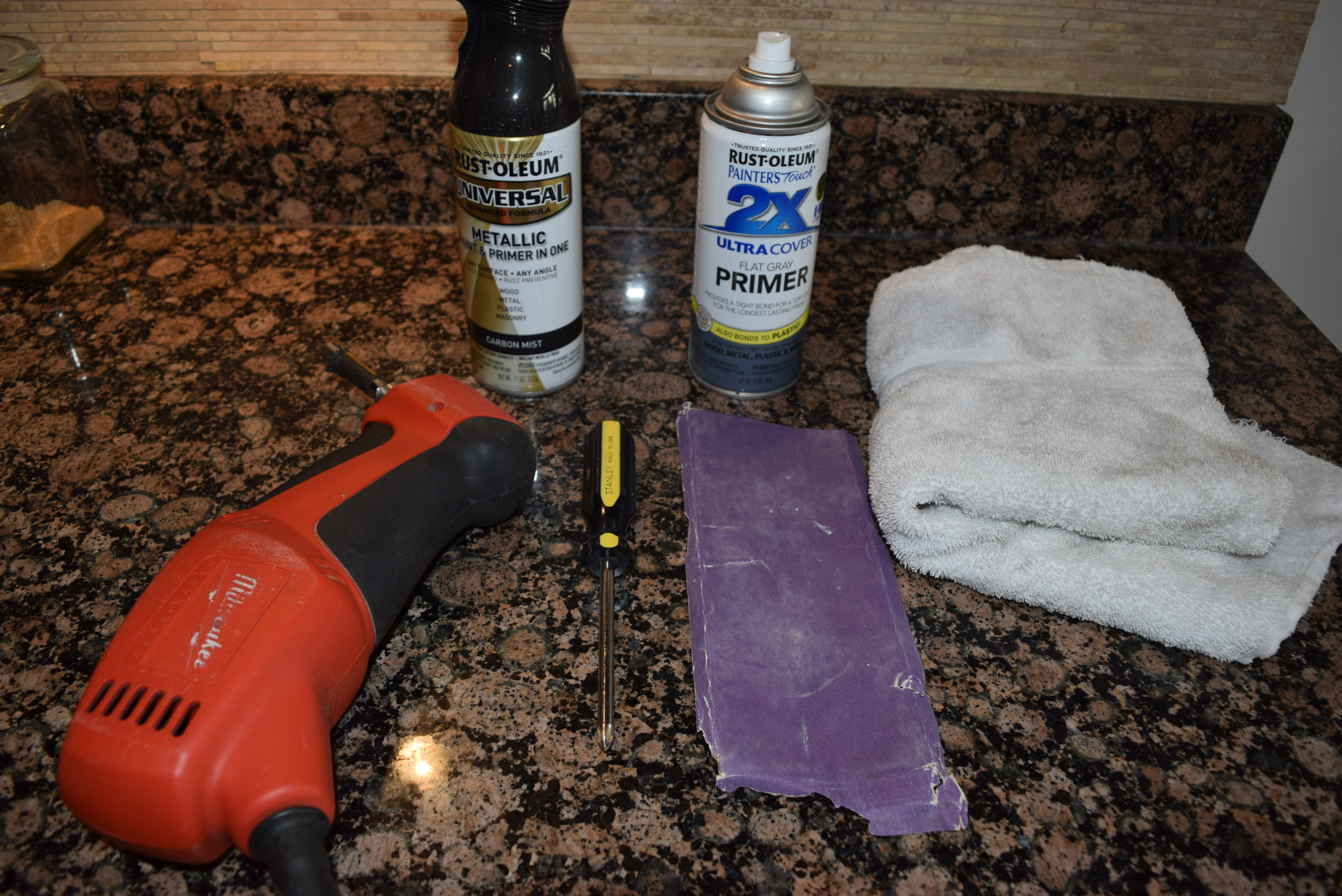
You’ll need:

  • Screwdriver or drill
  • Fine grit sandpaper (I used a 220 grit)
  • A rag
  • Spray primer, standard grey which will work just fine if painting hardware bronze, pewter, stainless or black. Note, even if your paint says it has primer included, don’t believe it, use a primer anyway.
  • Spray paint (I chose an almost black with a shiny fleck to it called Carbon Mist)
dsc_0012


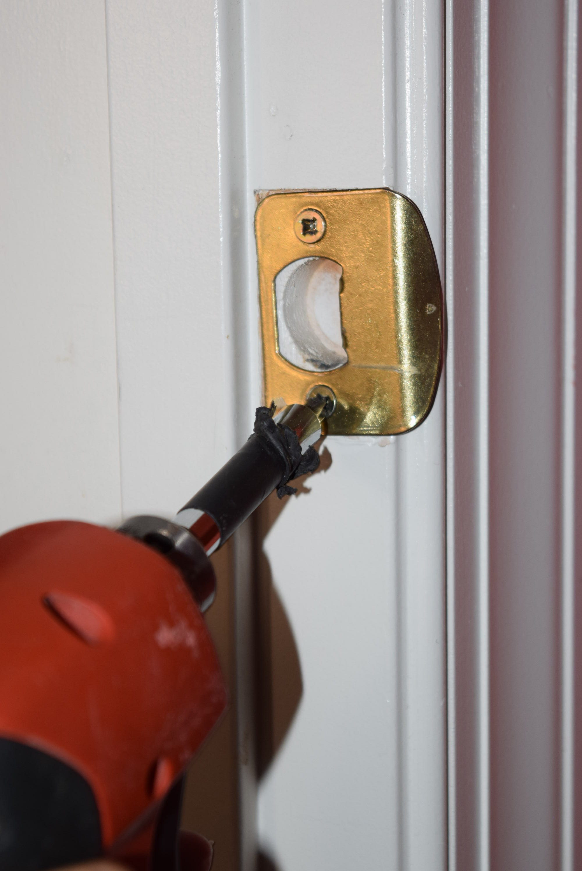
    1. Remove the hardware from the door.  This can be done with a screwdriver but if you have a ton of doors it may be worthwhile to bust out the electric drill with a screwdriver attachment to make the job go faster.  Some people might opt to just do the handles, but it won’t look as complete or cohesive to the discerning eye.  I recommend doing the whole shebang: handles, hinges, screws while you have the drill out.
dsc_0010


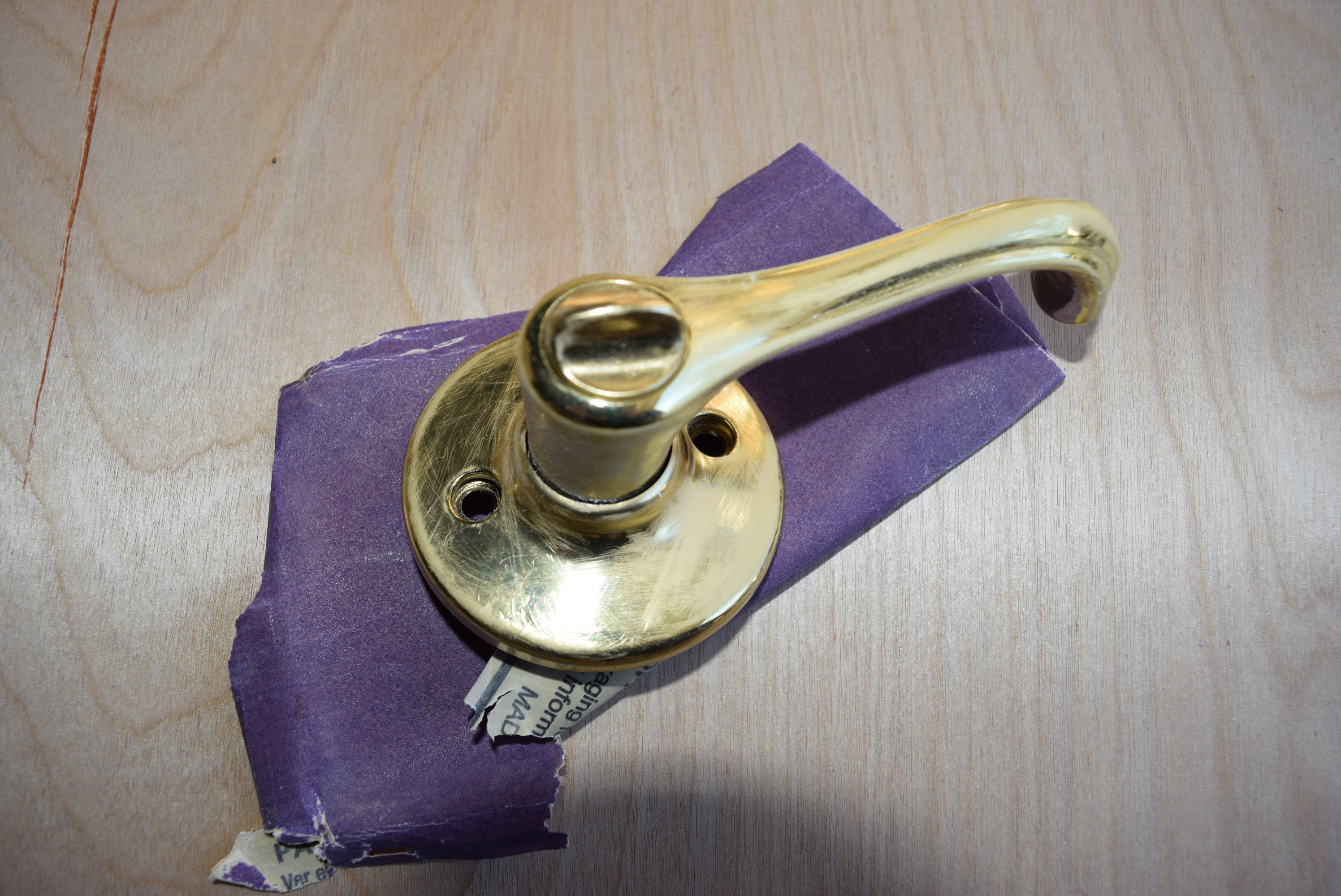
2. Rough up the hardware and get it ready for paint by scouring it lightly with the sand paper.
dsc_0020

3. With a damp rag, wipe off any sanding dust or residue

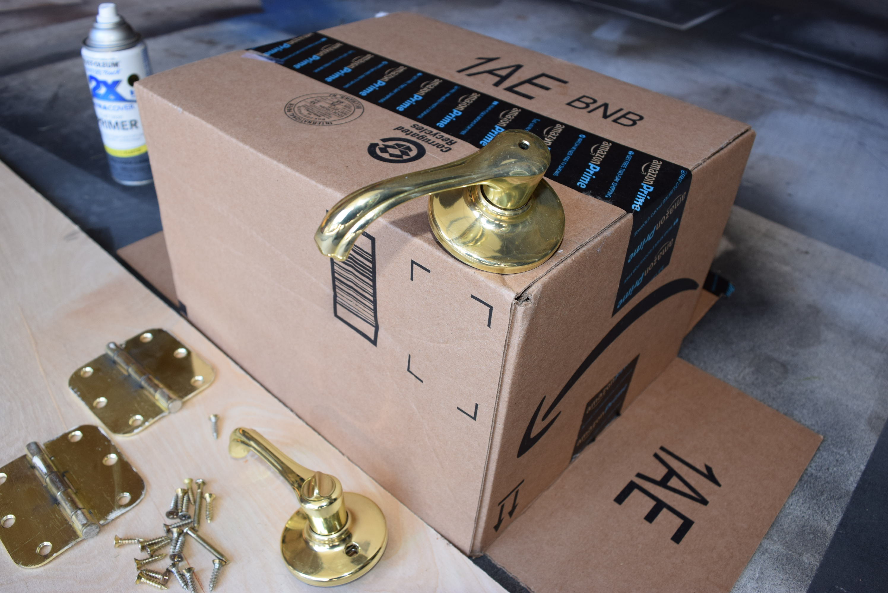
4. Prop your hardware up in a way that makes it possible to spray the entire handle at once. I chose to take the prongs that go through the inside of the door and inserted them into a cardboard box so that the handles were standing up.  As for hinges, I laid them flat and after one side was dry, flipped them over.
dsc_0017


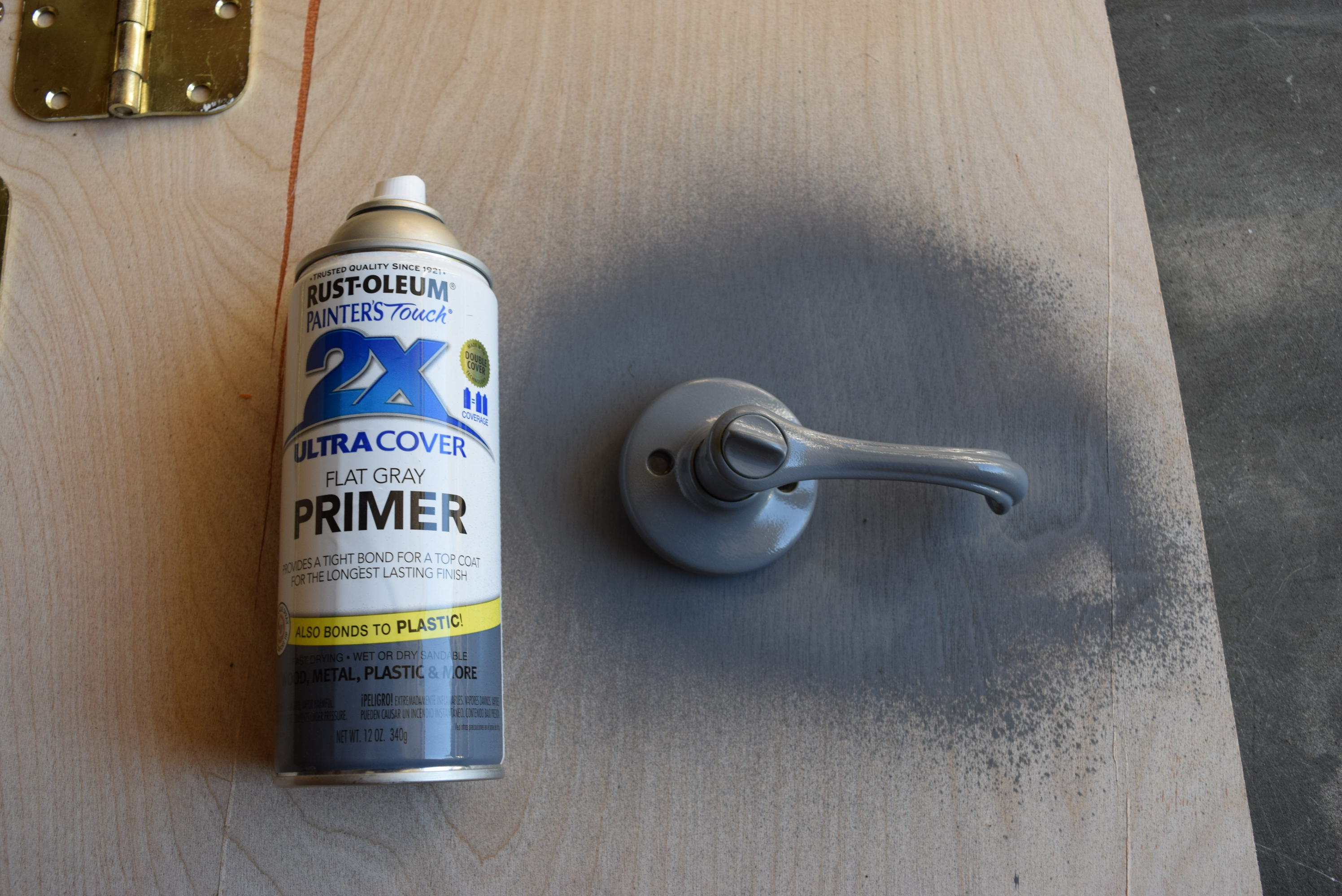
5. Coat your hardware with primer following the directions on the can.
dsc_0024


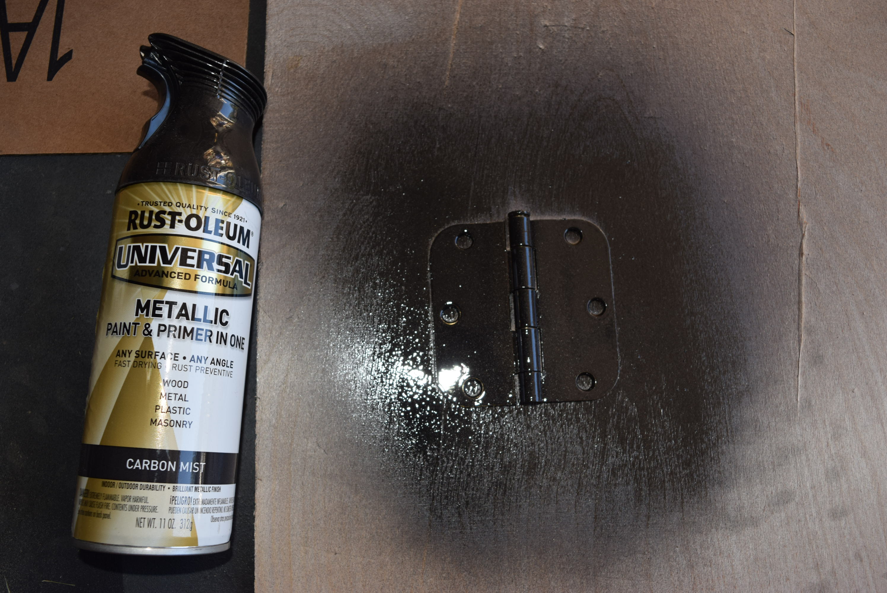
6. After allowing sufficient time to dry, apply one coat of paint, allow to dry and repeat with another coat. I found that one coat of primer and 2 coats of paint worked best for my hardware.
dsc_0025

7. After it is completely dry, rehang the hinges and hardware.

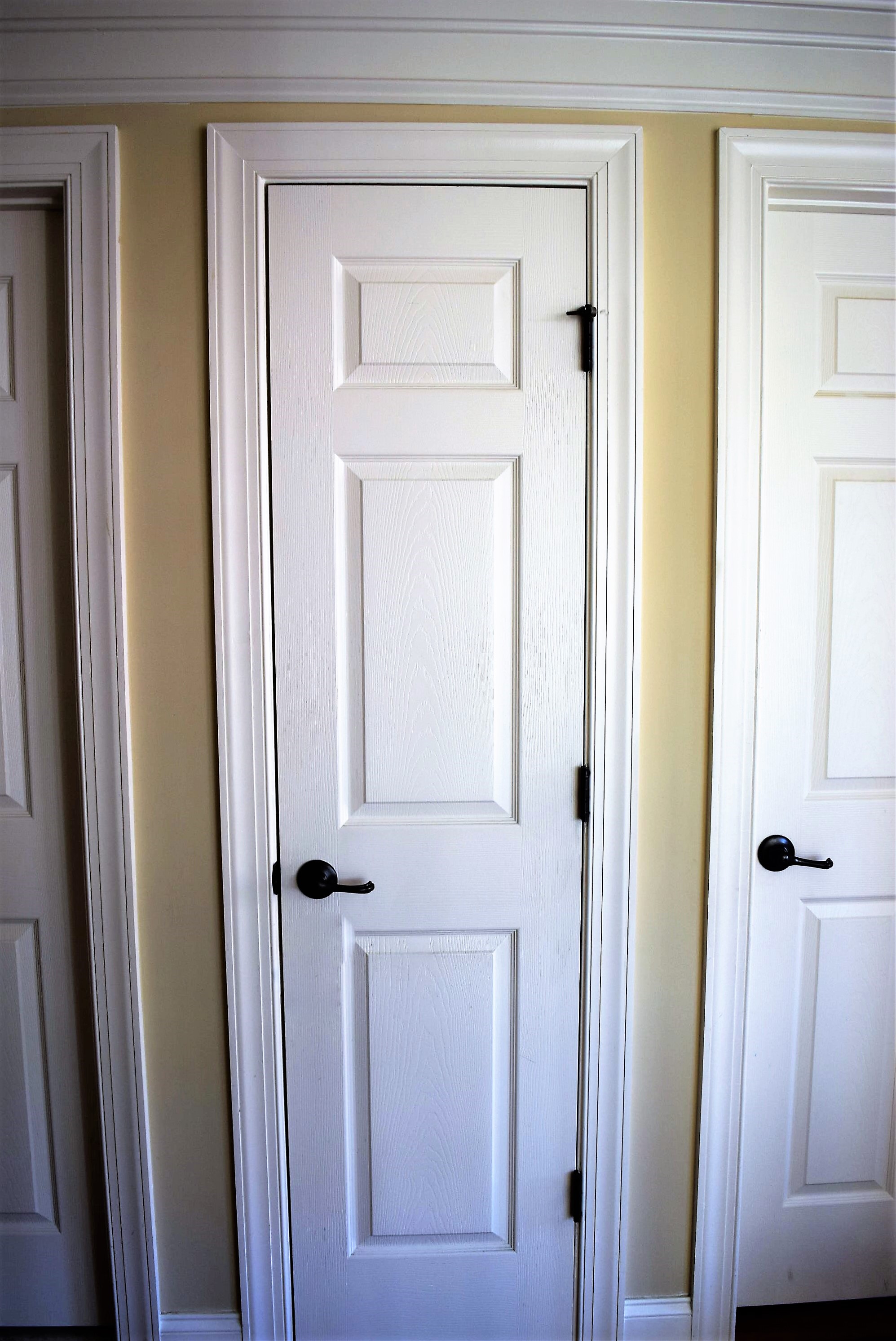
8. Marvel at your handiwork and how you were able to beat the crappy builder grade brass for a fraction of the cost!
dsc_0030-3


Gallery Wall Greatness

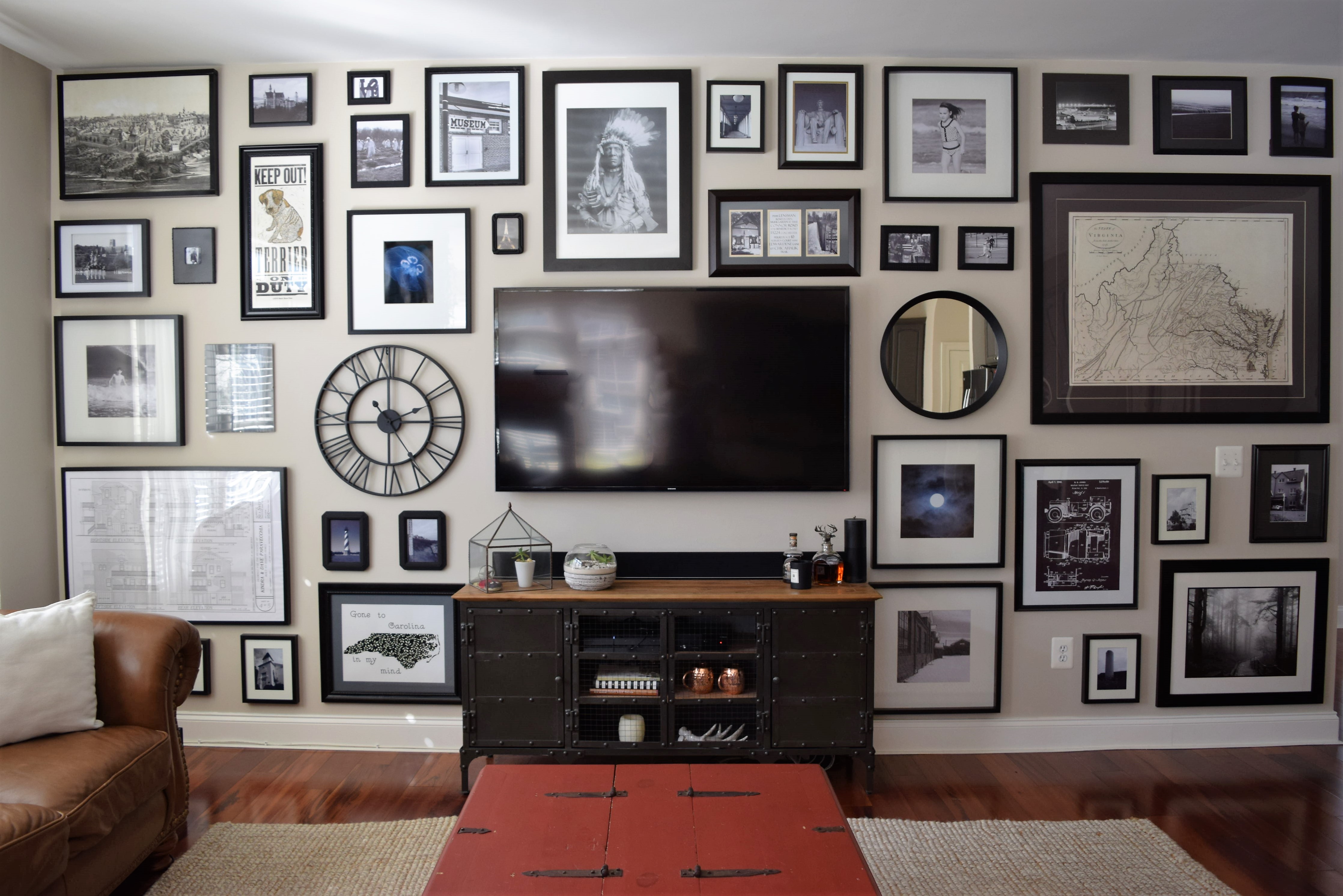
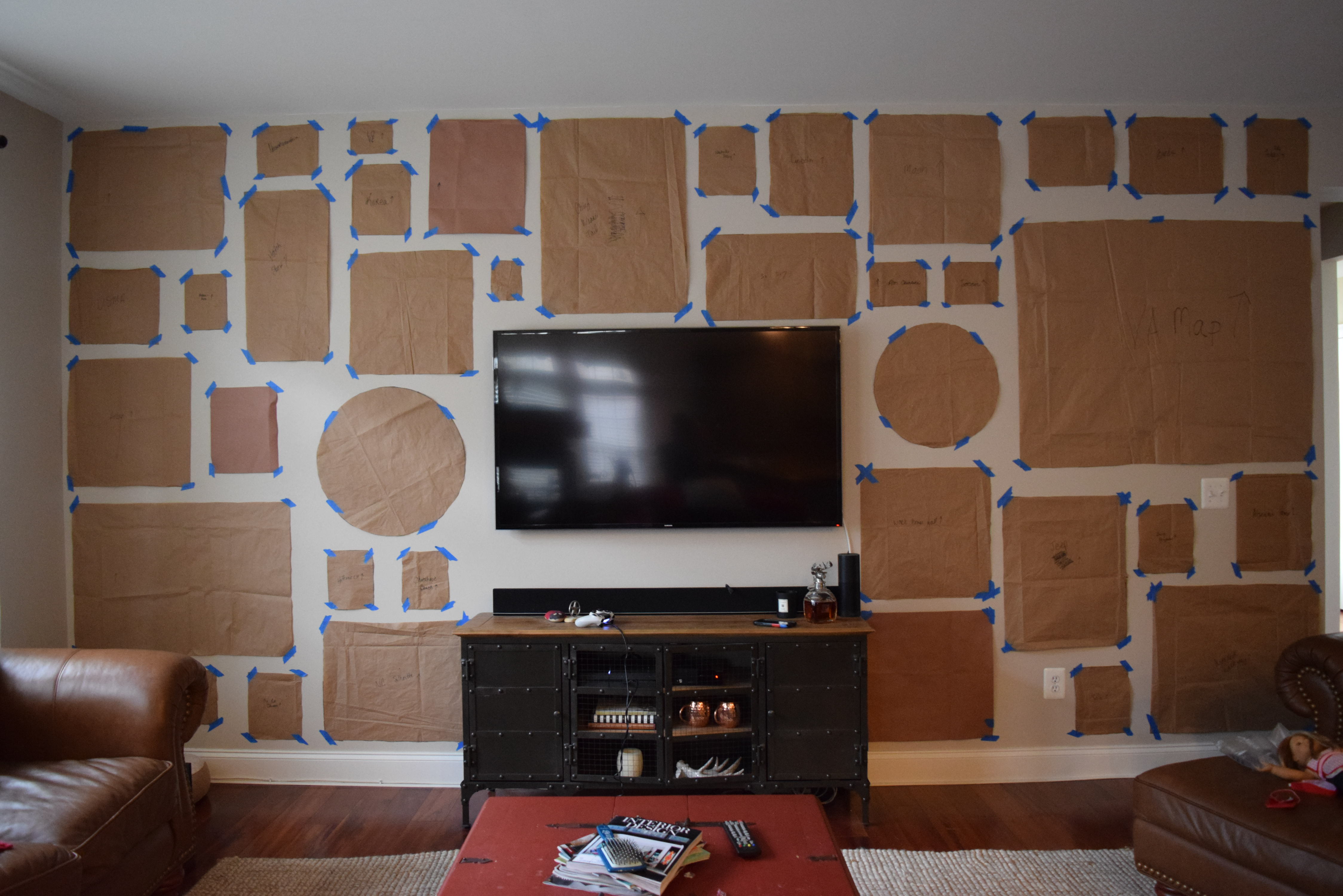
About 2 years ago we bought a new TV for our family room.  We mounted it smack in the middle of the only real wall in that room, the others being covered in windows or too short to accommodate it.  This created a really awkward situation for the rest of the wall.  It was just too … well… blah.  Even with a large TV the wall was too stark, too naked.  Placing a piece of art on just either side of it would be too matchy-matchy.  For a while I considered covering the while wall in a dark hued board and batten, but ultimately rejected that idea because it may have looked out of place next to the adjacent colonial style chair rail molding in the dining room.  I finally decided on a black and white full-wall gallery.    And yup, it took me 2 freakin’ years to do it.  Well, at least that’s when I started collecting frames at yard sales and from the Ikea “as-is” area.  In actuality it took me maybe 2 active months, once I thought I had collected enough frames, art and photography.  And by the way, if you ever embark on a full gallery wall, you’ll never have as many frames as you think you do.  I ended up scrounging and painting frames from all over the house to fill any leftover blank spaces.

I really should have taken a true before photo with the lone TV hanging on the wall, but alas, I didn’t, so the best before shot I have is the wall covered in brown craft paper that I moved around ad nauseam to get everything placed right where I wanted it. So here’s the before:

dsc_0459


And the after…. so much better than staring at the starkness of a TV and blank wall!  A great way to disguise a TV without having to cover it up!

dsc_0471-2


Do you have a gallery wall to share?  Add a link to your favorite in the comments.

Haunted Halloween Decor

Halloween is huge! It seems like all major retailers carry Halloween decor items for both indoor and outdoor.  And it’s more than just those wispy cotton spiderwebs that look great for a minute until it rains or the ‘ol standby DIY sheet ghosts.  Halloween decorations today are thoughtful, imaginative, chic, and wonderfully creepy.  Here are a few favorites that will spook up any home.

So, I’m not sure if this first one from Grandin Road is cute or creepy.  Cute because its dogs, but creepy because obviously it’s supposed to be dead dogs,  so there’s THAT… nevertheless it makes for a scene that would garner a lot of looks for your front lawn.

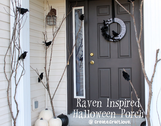
I’m a sucker for black and white, and while this porch scene by Jill at Create.Craft.Love is simple, it also has class.  Even those without a DIY “bone in their body” might create this sophisticated porch.

raven inspired halloween porch

This one would be fantastic all lit up at night, so start scouring sales at the hobby stores for all those funkins and battery operated tea lights.

https://s-media-cache-ak0.pinimg.com/originals/72/73/d0/7273d009971aa6ce09c68edb0f36e789.jpg

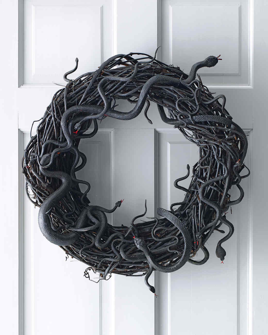
Martha Stewart is the queen of Halloween (I figured that was nicer than making some witchy remark), but seriously her empire is crazy imaginative when it comes to Halloween and in my opinion nobody does it better. This wreath is so simple and would be so easy to create, such a great idea, I can’t believe I didn’t think of this before.  Duh, it’s because I’m not Martha.

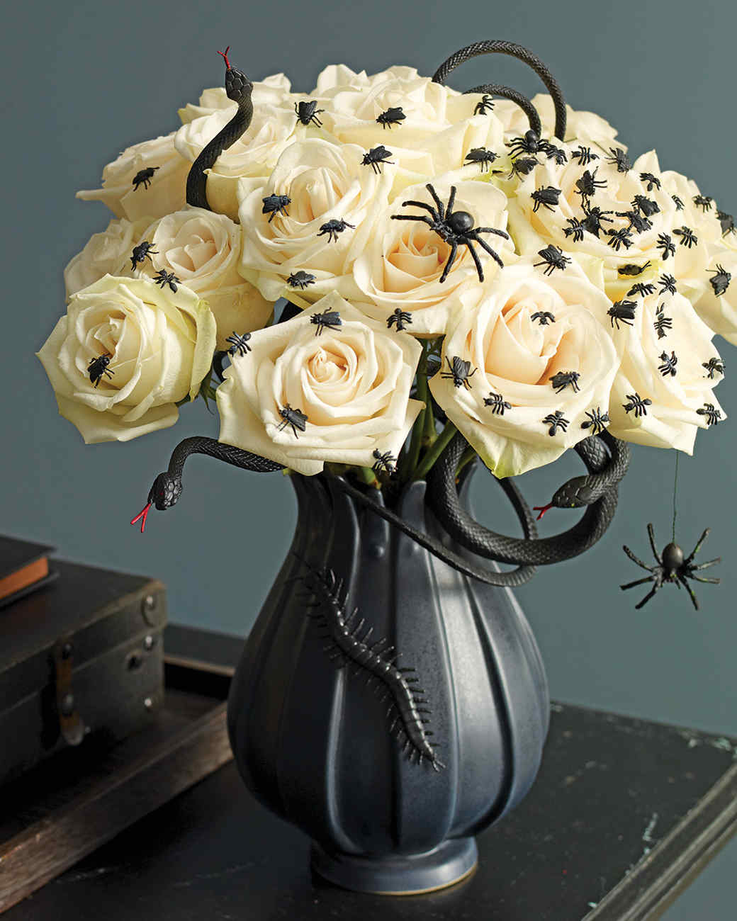
And the indoor version also by Martha, a great contradiction of spiders, flies and snakes with pure white roses.

For a party or special event the ripped cheesecloth  draped over the sofa and bats on the wall is spooky and fun.

The Best Room Ideas for Halloween halloween decoration ideas The Best Halloween Decoration Ideas Room Decor Ideas Room Ideas Room Decoration Halloween Halloween Decoration Ideas Homemade Halloween Decorations 13


This foyer idea is genius and so cute.

Our Indoor Decor ~ Withering Heights Inn (New for 2015)-coatrack.jpg:

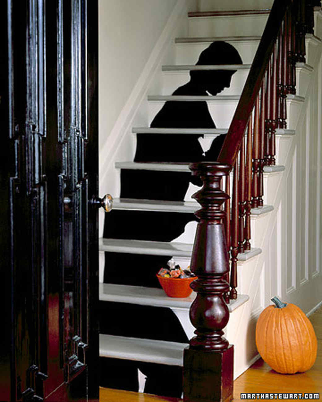
And a final smart and classy idea from Martha.  You could do a silhouette of just about anything spooky.

What are your great ideas fitting for for a disturbing Halloween decor?

Discount Dozen: Pendant Lights under $100

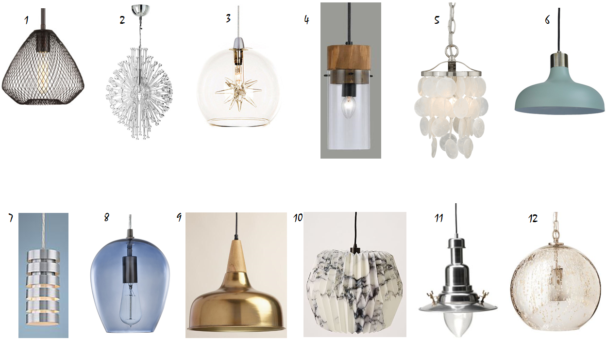
I have always been fascinated and wowed by all of those Pinterest posts of crafty people that DIY light fixtures from all kinds of junk. Mason jars, wine bottles, toilet paper tubes, you name it, pinners can make a light out of it, by just buying a “simple pendant light kit at your local hardware store”.  Ok, now, I don’t doubt that it can be done and while I’m willing to invest time in home projects, I’ve just never gathered the motivation to DIY a light.  Perhaps it’s because there are so many great inexpensive options out there already.  Here’s a quick discount dozen lights, with great style that I’ve found for under a hundred bucks. Heck, 5 of them are under $55!

discount-dozen-lighting-under-100


  1. Progress Lighting Mesh Pendant $83.60
  2. Ikea Stockholm Chandelier $99.00
  3. ET2 Starburst 1 Light Globe Pendant $52
  4. World Market Wood and Glass Pendant Lamp $89
  5. Bella Coastal Elsa Mini Pendant Light $98
  6. Threshold Crosby Collection Small Pendant Light $31.49
  7. Lamps Plus Lite Source Tendril Mini Pendant $91
  8. Allen and Roth Brushed Nickel Art Deco Mini Tinted Glass Bell Pendant $47.98
  9. World Market Brass and Wood Glenn Pendant Lamp $69
  10. West Elm Fanned Paper Pendant $69
  11. Ikea Ottava Pendant $34.99
  12. Threshold Mercury Glass Globe Pendant $53.99

Indoor Plants Bring Life!

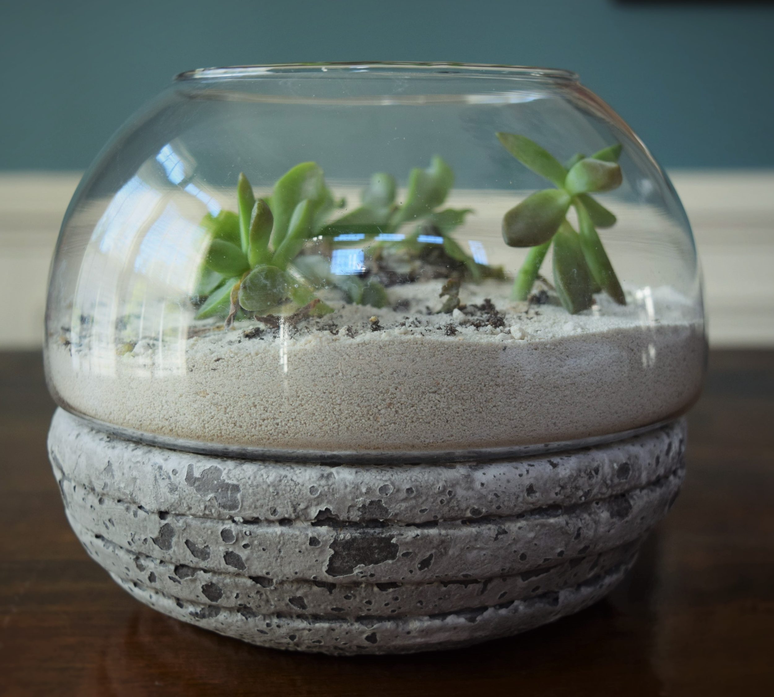
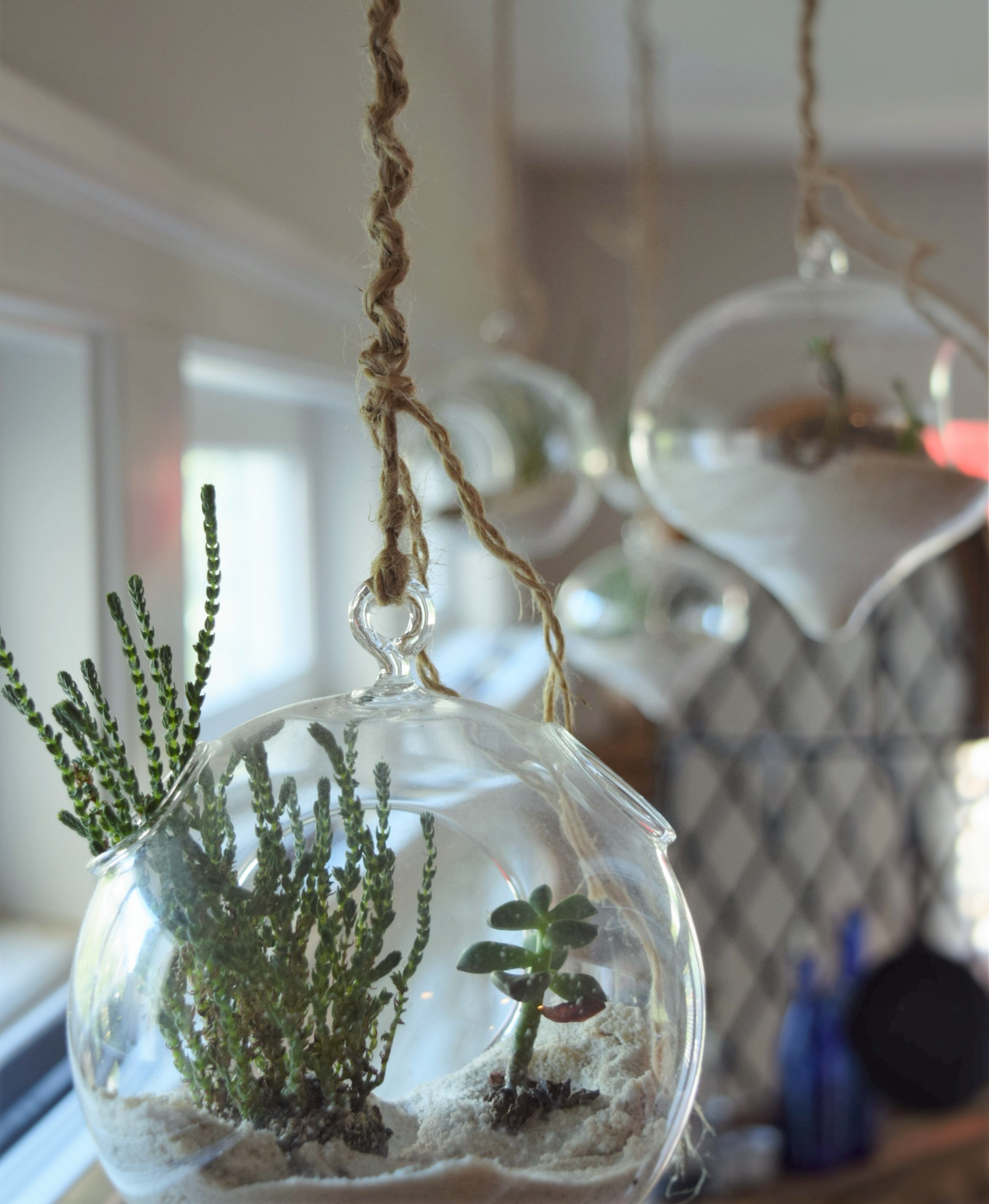
I’m guilty.  I know that adding greenery in the form of an indoor plant to a room can really complete a look and help things feel bright, clean and natural. I have broken this rule. In my living room there is one small terrarium of succulents and in my kitchen I have several hanging terrariums of succulents.  That’s it.  Pitiful. As you might imagine the draw for succulents is that they are so interesting to look at and … ahem … really hard to kill for those of us with green brown thumbs.  So here’s my pathetic indoor plant collection, all 2 of them.

dsc_0334


dsc_0338-3


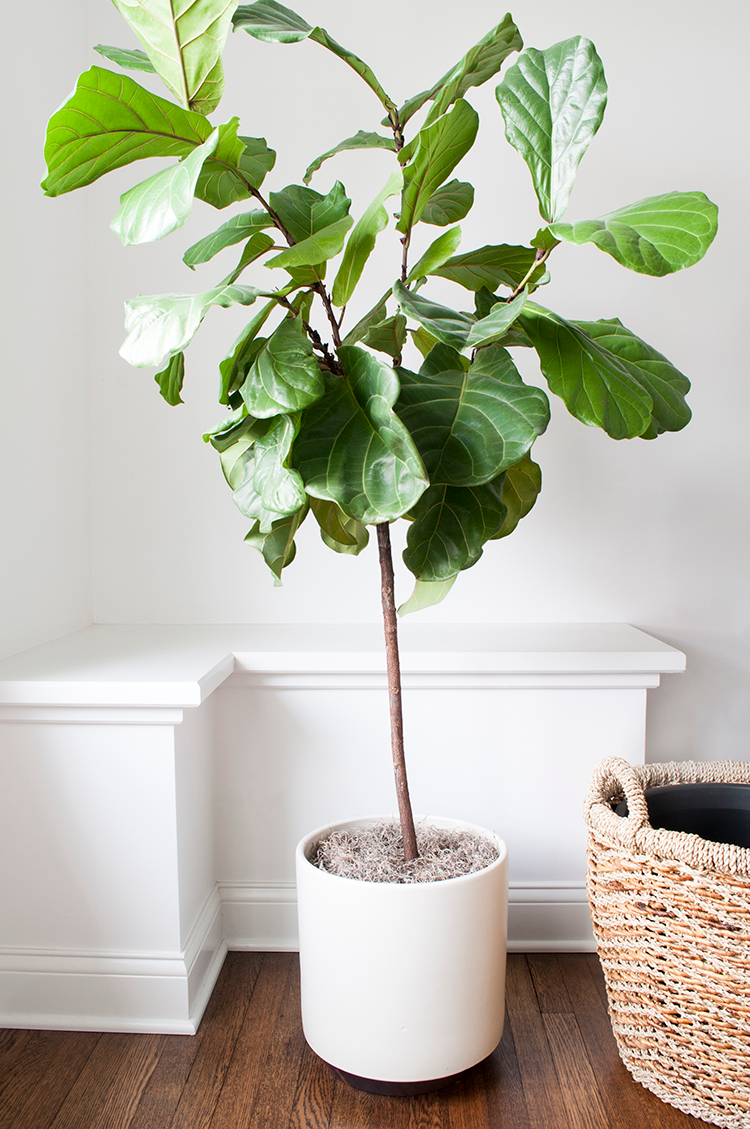
Now, here are some indoor plants that I should use to up my interior oxygen boosting game.  Every design pic I’ve been seeing lately has a fiddle leaf fig in them.  They look exotic, are terrific growers, give exceptional size to those spaces that can accommodate them and they are apparently hearty (maybe we’ll see about that).  I’m redecorating my living room soon and I definitely plan on including one.  Fingers crossed I don’t kill it.

fiddle-leaf-3


I always try to put some greenery into my client’s designs and this little baby is perfect for the client with a small budget.  It’s a Majesty Palm.  Can you believe it, it’s just $12 at Ikea?  So you won’t feel too bad if you kill it.  These look great potted in a large urn or basket.

majesty-palm


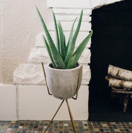
I am not a fan of keeping houseplants outside and then bringing them inside to your living space for the winter… bugs…. uh no thank you.  This aloe plant is perfect for year round interior living and are also very forgiving as they don’t need a ton of watering.

aloe


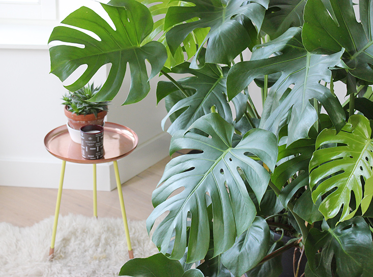
The monstera, also affectionately called the “swiss cheese plant” has very interesting “holey” foliage and would look fabulous in a large floor bucket or an urn atop a table.

monstera

Copper …for More Than Kettles

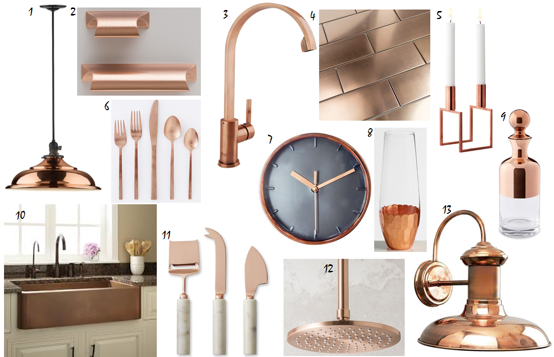
Metal accents are an important part of any home design. Trends in home metallics seem to shift about once per decade. The 80’s had bright fake looking brass, the 90s had chrome, the 2000’s had brushed nickel, and the 2010’s saw brass making a resurgence in its brushed form.  Now I’m starting to see copper all over the place.  I’m glad that this may mark the end of the brass era or at least calm it down a bit, I was never able to get fully on the bright gold bandwagon.  Copper, however, is a metal candidate that I can fully endorse. It can add a bright highlight in a range of shiny pink, peach or orange or a more dulled and worn green, blue or bronze color after exposure and patina.  Here are some great items to add to your home to keep up with the copper trend ranging from the minimal investment in a Target clock to fully committed farmhouse sink.  Links to items in the list below.

copper


  1.  Baltimore Pendant
  2.  Card File Pull
  3.  Fountain Cove Modern Antique Faucet
  4.  Metal Copper Stainless 2×6 Tile
  5.  Lassen Line Candle Holder
  6.  West Elm Copper Flatware 
  7.  Threshold Wall Clock
  8.  Copper Rim Spirit Decanter
  9.  Kembla Copper Farmhouse Sink
  10.  Marble and Copper Cheese Knives
  11.  Strata Showerhead
  12.  Progress Brookside Outdoor Wall Sconce

Paneled Walls

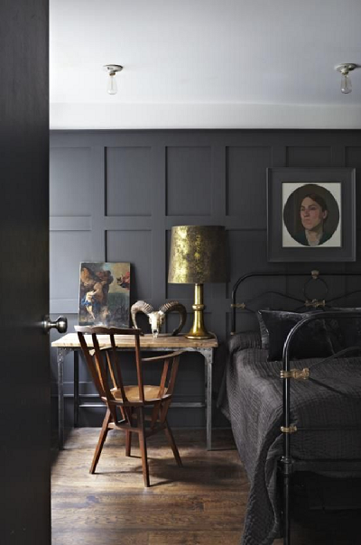
Probably the best way to describe the current style of home I live in is a “modern colonial”. This is designer talk for builder grade, brick front, siding on 3 sides, tract home, built in the early 2000’s that looks almost like all the other 200 homes in the neighborhood.   No, not ideal, BUT it lends itself to a number of interesting decorating techniques with little risk of truly screwing anything up.   I’ve been looking for a way to incorporate a paneled room.  I’m not talking about creepy knotty pine paneling but a more modern but still classic look.  I need to figure out how to work this into my place and found these below to be inspirational.

This one is a dark matte grey that looks (combined with the styling here too) minimalistic and shaker inspired.  This would be a relatively inexpensive and easy one for a DIYer to recreate as there aren’t any mitered joints.  You could affix inexpensive pieces of pine that have been ripped on a table saw lengthwise at right angles to each other.

grey-shaker


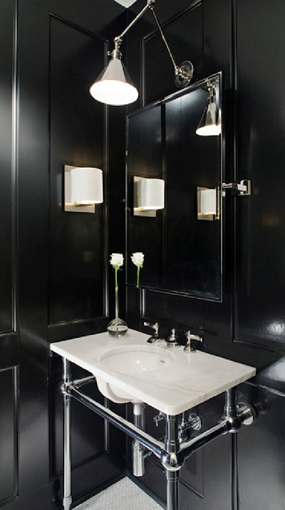
This powder room by Ty Larkins Interiors has a black high gloss paneling that makes this small space look grand, not what you’d expect moody black paint to do.  I really love the overhead light fixture since it’s a bit unexpected style for a bathroom.  (I’m still on the fence with the second wall mounted light).  I wonder if the homeowner is constantly dusting off the horizontal ledges of molding? Meh, it’s worth it.


glossy-black-bath


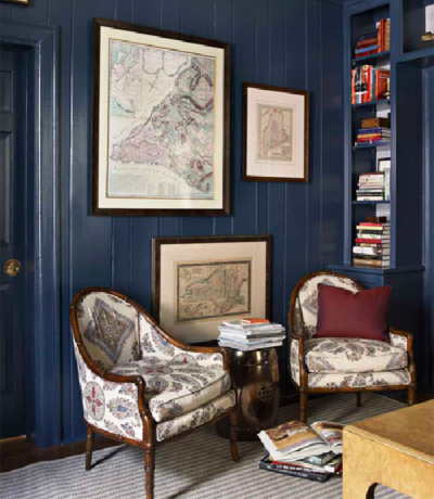
So you’ve saved up enough to buy a beach cottage, but of course it comes complete with that very scary knotty pine paneling on the wall.  Naturally you can’t leave it like that, so what to do?  Well… paint it navy blue.  While you’re at it, paint everything navy blue, the walls, the trim, the bookcases.  Adorn it with some maps and cute chairs (which I wish were upholstered in something different) and it looks like you meant to put up this paneling, on purpose!

blue-paneled


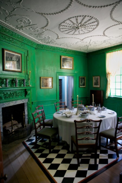
Okay, admittedly, this is a lotta look, but I think if you were the owner of this home you can get away with it.  Can anyone guess?  Yep, it’s one of the dining rooms in George Washington’s Mount Vernon Estate.  While I’d never recreate a room that looked just like this I do occasionally like to borrow ideas from classic American homes, especially those that are befitting of the style of the region (Mount Vernon is right down the road from me).  So a more modern take on a vibrant green with wainscoting would be gorgeous with old refinished heart pine floors.

mount-vernon


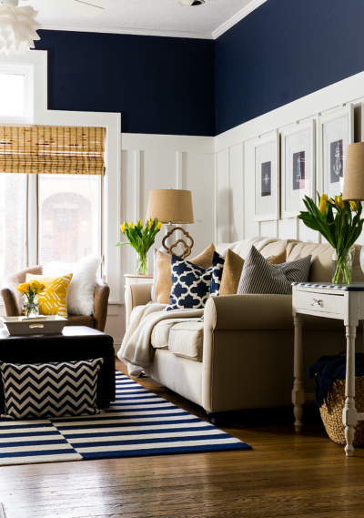
Jumping in with a deep paneled wall right away can be scary for some color phobes. I do adore this more traditional integration of paneling and deep color.  White board and batten 2/3 of the way up the wall and topping it off with a deep navy can give either a traditional or nautical look.  Best thing, it’s easy to DIY this look.

board-and-batten

Falling for Wreaths

I don’t know how it happened but after I got married and moved away from home one of the first design elements/ DIY projects I became obsessed with was creating a really killer front door wreath.  At the time, I was creating wreaths left and right, for my own front door, for family doors, for every season and holiday.  It’s been a while since I whipped one up but I still love ogling front doors and what people decide to adorn them with. A good wreath can enhance a beautiful door, or hide the flaws of an ugly door, or just happily welcome a new season.  So today I’m sharing some of the best fall wreaths I’ve seen out there lately.  Since it’s the first day in a zillion when it’s under 90 degrees here in Northern Virginia, I feel like it’s finally ok to swap out my summer wreath for the fall wreath on my own door and maybe even make a new one.  Which one would you create this autumn? Click the image for the sources.

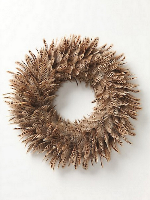
The post where I found this one said it could be made from feather dusters, which I think would take forever, but it sure does look great.

feather-wreath


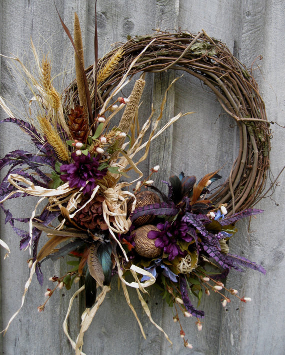
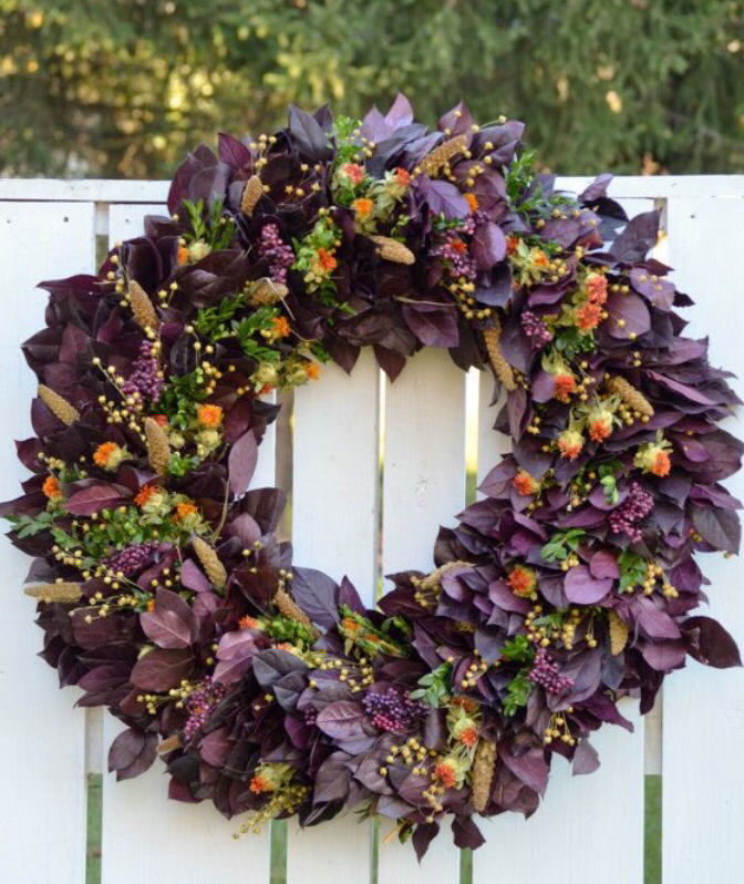
I love the addition of purple to these next two wreaths, it’s a little bit unexpected for fall and adds a lot of interest.

fall-wreath-purple


fall-wreath-purple-2


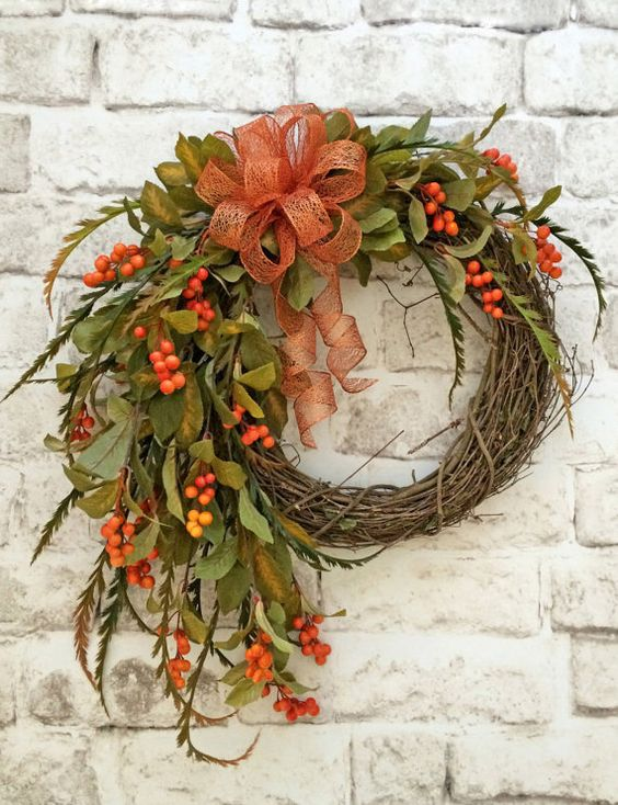
This one, with a more traditional autumn color scheme has a wonderful cascading effect.  I might opt for a more rustic looking ribbon since I think this perfect ribbon would look like a mess if exposed to the elements (and by elements I mean wind, rain, and the neighborhood kids yanking on it).

fall-wreath-orange


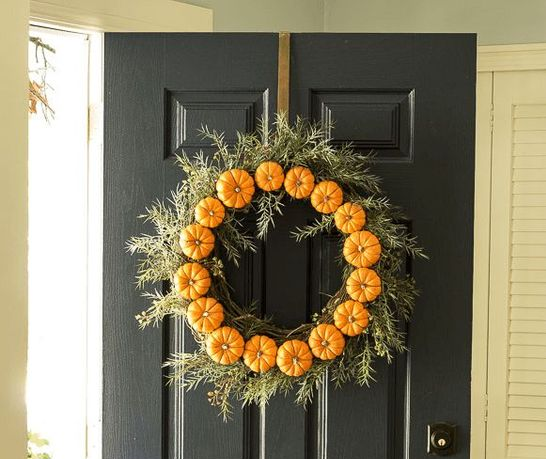
This one with mini pumpkins by  On Sutton Place is adorable.

mini-pumpkin-wreath


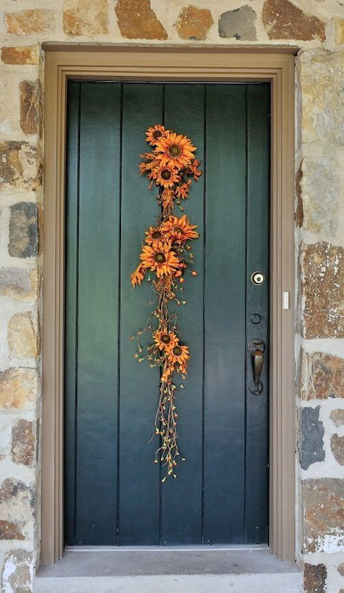
This simple vertical swag by Stagetecture looks simple but gorgeous, and a phenomenal stone wall doesn’t hurt either.

simple-orange-vertical-swag


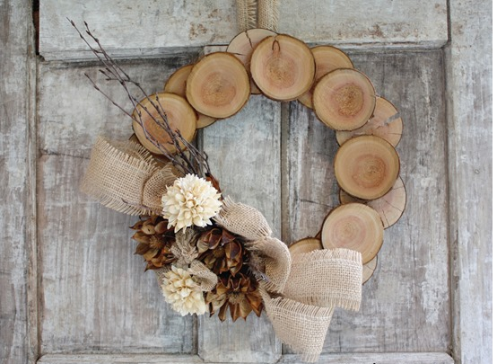
And finally a few cuties that make the best of raw natural elements and display them perfectly.

wood-slice-wreath


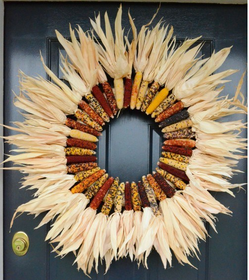
indian-corn-wreath