Three Cheers for the Red, White and Blue

The colors of old glory, perfect in their patriotism and symbolism of the US of A, yet colors that are often poorly designed and styled.  Frequently this patriotic color combo is avoided altogether because, let’s face it, nobody wants their house to look it came straight out of a 1980’s issue of Country Living or like Grandma’s reproduction Amish quilt.  Doing red, white, and blue right can be hard, but it CAN be done.  With some patience and a discerning eye the colors of the USA can be great in a nautical look, a playful kids vibe, a rustic farmhouse look, or a more traditional style. Here are a few examples of red, white and blue styled rooms that look oh, so perfect!

Nautical

Here’s a modern nautical bedroom from County Living.  Before looking at the room you might think that striped bedding AND striped wallpaper would be overdoing it, right?  Nope, in here with the simple metal bedframes and lots of bright light it all works.  I particularly love the curtains that are each different large scale nautical flags!
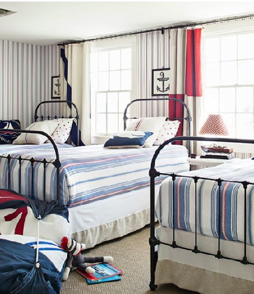
nautical red white and blue bedroom

Farmhouse

This farmhouse cottagey look DOES utilize an Amish looking quilt, but it’s styled so perfectly with the warm white walls and pops of strong red (not a washed out red that would look too country) in the nightstand and vase of poppies.  The jute rug adds a natural, neutral element that grounds the entire space.  Photo via pinterest.
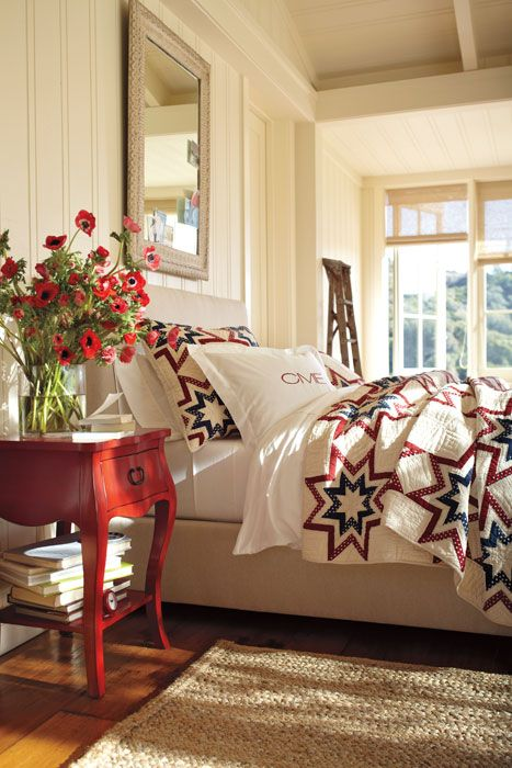
farmhouse red white and blue


Traditional

This traditional space featured on B.A.S. is a relatively small space with tall ceilings.  The designer here went crazy with mixing patterns, BUT it’s visually supported by so much neutral and white that it totally works.  It doesn’t look cheesy Americana or anything, just a fun version of traditional, and it totally works.
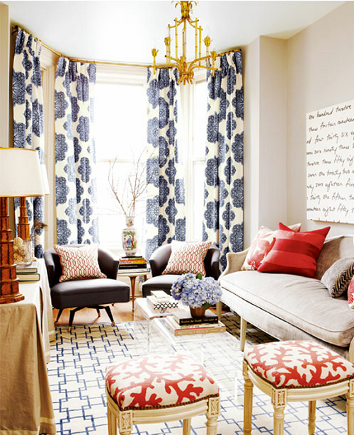
traditional red white and blue


Another traditional space, this one by Andrea Schumacher, mixes soft blues, bold reds and tones it all down with neutral grasscloth wallpaper.
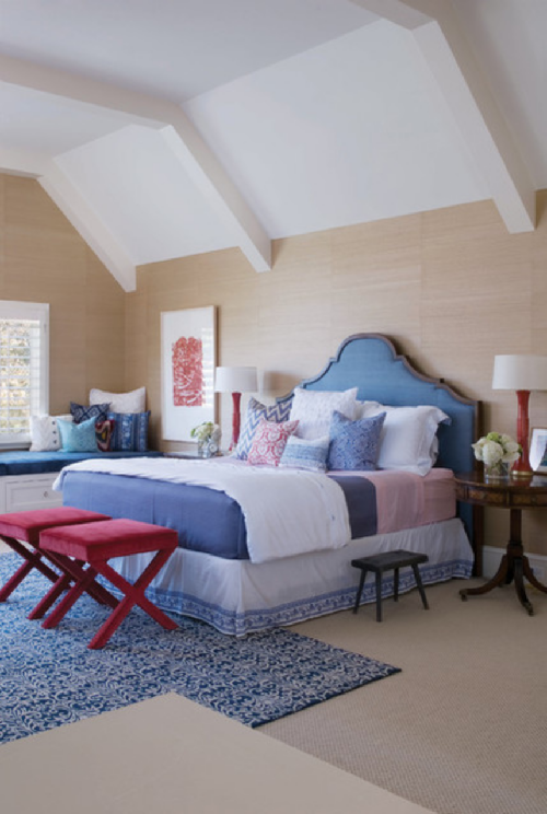
traditional bedroom red white blue


Exterior

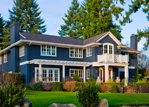
This classic color combo works on home exteriors as well just like this one here by Andrea Braund.
 

And certainly, if there is any place where you can get away with a little bit of patriotic kitsch, it’s the front porch, since it’s almost more like holiday decorating than permanent decorating.  This one, which I think is a several years old styling by Pottery Barn, still looks classic and cute.
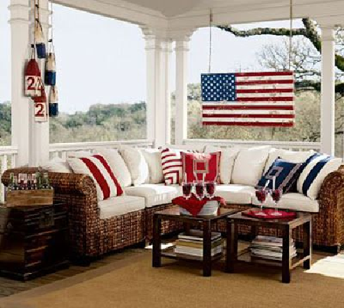
patriotic porch

Have a fun Memorial Day weekend and please take a moment to remember all those who have died in service to our nation and have given so much to keep us free!
Eco-Friendly Farm House

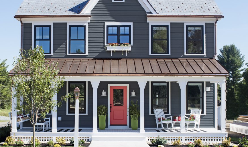
In this month’s edition of This Old House Magazine, they’ve featured a home that I think is almost absolute perfection (for me, it would be absolutely perfect if it were on a larger piece of land).  This Old House’s 2016 Idea House is a newly built farmhouse that’s a modern version of classic farmhouse style, with lots of green features and a smaller footprint…. not the McMansion size of yester-decade, nor the tiny mouse-house size, but a Goldilocks just right size of 1900 square feet.  Here’s some of what I really love about this place.

First, the outside look is just so appealing and charming, with the copper roof over the porch, the black vinyl windows and that salmon door is just so inviting! Sometimes it’s also what’s NOT present that can improve curb appeal, in this case, garage doors, which are located in a detached garage at the back of the property.

toh-exterior


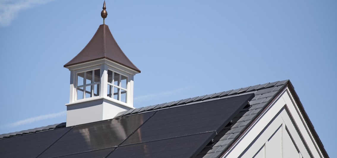
This house uses less than half the energy of what the average house of a similar size would consume, thanks in part to the solar array on the roof of the garage.  Sure, it requires an investment up front, but if you plan on living in the home for a while, live in a state that offers tax advantages for eco-friendly home improvements, and idealistically want a better planet for your kids, then solar is the way to go.  Plus, who could resist an adorable cupola?

cuploa-and-solar


I’ve always thought rain chains were a charming feature of older homes, but I never considered their eco-friendliness before.  The rain chain channels the water to a bell cup and releases it in a controlled fashion down the chain to the awaiting garden, or terminates in a cistern where water can be used for watering plants later.

rain-chain


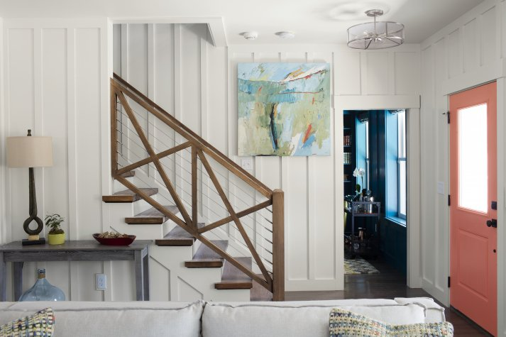
The inside of the home has some wonderfully modern yet charming features as well.  This baluster and railing system is amazing.  And can we talk about that board and batten on the interior for a minute?  It adds so much visual interest, and the white keeps the room bright and airy.  From a practical standpoint, the board and batten can be painted in a semi-gloss, since it’s technically a “trim” and will be so much easier to wipe down when dirty or scuffed which is perfect for a smaller space that is inhabited by kids and pets.  I’ve been seriously considering a board and batten for this very purpose up and down the stairs and halls of my rental beach property, I may be thoroughly convinced now.

toh-railing


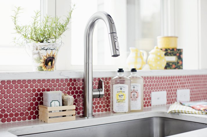
I’ve always wanted a reason to use penny tile and I just haven’t found the right place for it yet.  I like that the designer of this space not only went with the penny tile but went bold and selected a red shade with bright white grout.  It’s a classic look that shouts “farmhouse!”

toh-red-penny-round


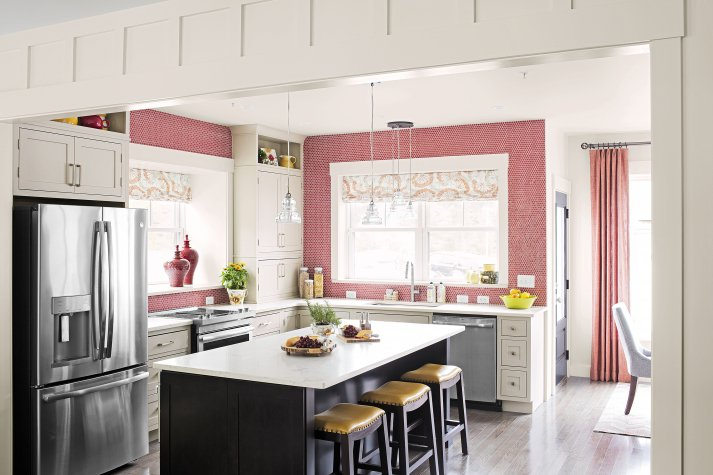
It’s a small kitchen, but taking the tile all the way to the ceiling adds visual height and space and the oversized contrasting island adds all the usable storage, counter and seating space a growing family could need.

toh-kitchen


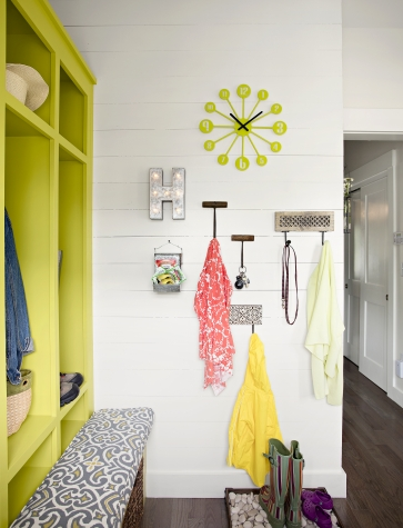
Even though most of us don’t live down on the farm, everyone these days still wants a mudroom.  And if it looks like this, well, who wouldn’t?  The bold citron cubbies paired with the dark wood floors and the white shiplap walls welcomes the entering  family with a vibe that says, “organize your crap”, but “still have fun”.

toh-mudroom


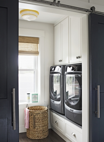
I might actually LIKE doing laundry if it were in a laundry room like this.  Ok, admittedly, I’d probably still not like it, but at least I wouldn’t cringe every time I walked past my laundry room. Now on my to-do list, revamp laundry room and include a barn door.

toh-laundry


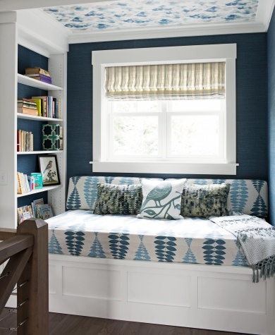
Navy blue and crisp white is a tried and true design trick that looks fresh and clean every.single.time.  I don’t think you can ever go wrong with navy and white.  This reading nook capitalizes on the navy and white perfection and takes it one step further by adding additional visual interest on the ceiling with a blue and white patterned wallpaper.

toh-windoseat


All the related articles and photos, all by William Geddes can be found at This Old House’s website, here. What’s your favorite part of the This Old House Idea House 2016?