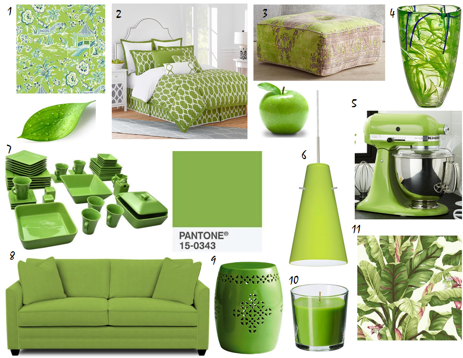
Every year in December, Pantone, THE color people, name a color of the year for the upcoming new year. They announced their new color, Greenery, last Thursday. I truly had it in my head for the last several days, thinking about this color, that I was going to talk about how much I hated it. BUT, as I built the collection of goods for this blog post, it actually started to grow on me. My initial reaction was that this shade should be reserved for granny smith apples and maybe a wicker set in a Florida room in Boca Raton. I do think it would be better with more yellow, leaning toward a chartreuse hue, but that said, I think Greenery does have some redeeming qualities and could add a nice punch to an interior when used judiciously. You won’t find me painting any walls this color, but when used in small amounts, with warm neutrals and lots of white, it could be just the pop your room needs. Here’s a few household items in Greenery -like – tints that work. I’m particularly loving the wallpaper options (#1 & 11). Either of them would make a boring powder room bright and happy. What do you think about Pantone’s Color for 2017? How would you use it in your home?

- Tahiti Scenic Ashford Tropics – Ashford House Wallpaper $28
- Jill Rosenwald Chain Reversible Duvet Cover $52
- Alanya Ottoman $298
- Kosta Boda Contrast Vase in Lime $89
- KitchenAid ® Artisan Green Apple Stand Mixer $329
- Besa Lighting Cierro Satin Nickel One-Light Mini Pendant with Chartreuse Glass $189
- 10 Strawberry Street Nova Square Banquet 45-Piece Dinnerware Set $59
- Sarah Sleeper Sofa $1200
- Green Garden Stool $99
- SINNLIG Scented candle in glass, Crisp apple $2
- Banana Leaf Ashford Tropics – Ashford House Wallpaper $29


